
Gone are the days when one could simply unleash an app into the world and keep their fingers crossed, hoping for the best.
Today, apps have to undergo extensive testing to be considered stable and user-centric, all while relying heavily on user feedback.
That’s why this article focuses on four practical strategies that will help you become skilled at gathering in-app feedback, so your app can grow and adjust according to the needs and preferences of your users.
Table of Contents
Make it easy to leave feedback
Gathering valuable feedback hinges on one crucial aspect—making it a breeze for users to share their suggestions.
If the process is overly complicated or takes too much time, chances are users will simply forgo providing any feedback whatsoever.
They won’t bother with all the unnecessary hassle—it just doesn’t seem worth their while.
To tackle this issue head-on, it’s a good idea to include a noticeable and user-friendly button or widget right within the application for feedback.
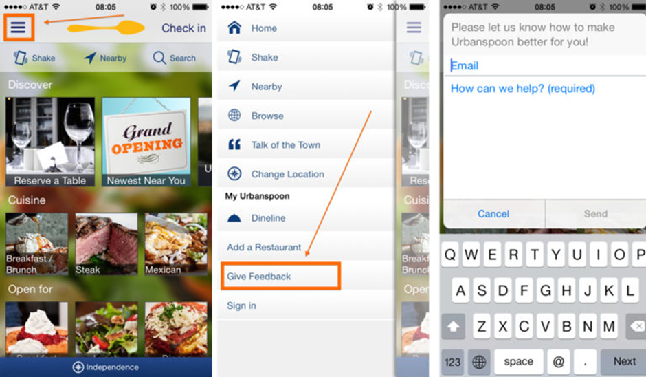
Strategically place it where eyes naturally wander—whether it’s the navigation menu, the settings section, or even a dedicated feedback tab.
For example, in the accompanying image, you can see a feedback link tucked away in the hamburger menu, the go-to spot users will instinctively check if they want to give a suggestion or comment.
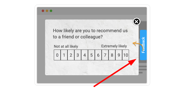
To further simplify the feedback process, you can consider implementing sidebar forms, small bars or tabs typically located on either side of the screen.
They stand out with a distinct color from the rest of the interface, making it effortless for users to submit their reviews with just a single click.
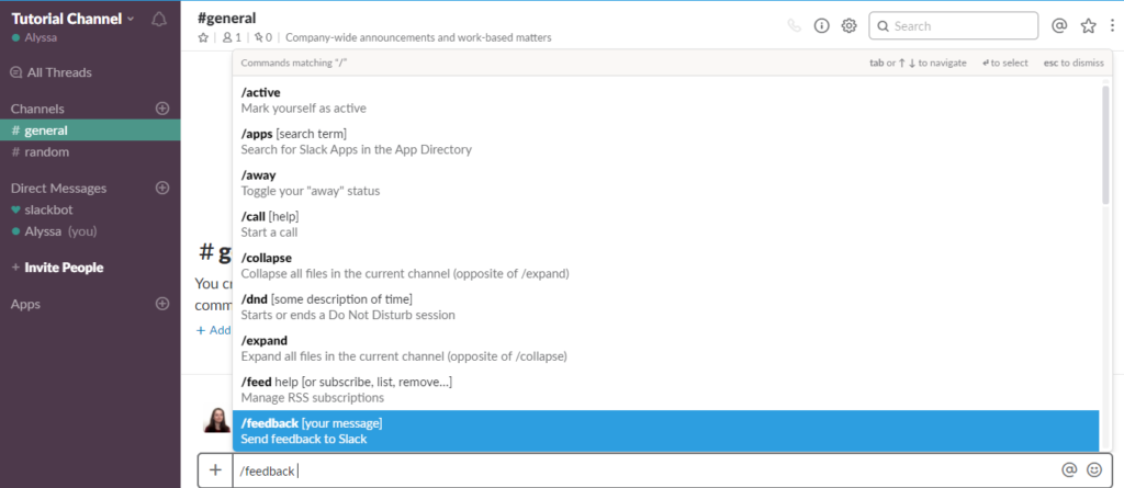
Additionally, some companies prioritize user feedback to such an extent that they offer a built-in feedback option.
Take Slack, for instance.
They’ve cleverly introduced a /feedback command that allows users to share their insights directly with the Slack team, without any delays.
Another convenient built-in option is the shake-to-send feature.
Here, users can simply give their phones a gentle shake to trigger the feedback options without having to exit the app or interrupt their ongoing activities.
Let’s use our application, Shake, a bug and crash reporting tool, as an example.
Whenever users wish to leave feedback, all they need to do is give the mobile device a shake, and a pop-up message will appear.
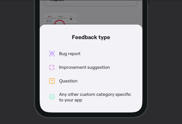
As you can see in the image above, this message guides users to categorize their feedback as a bug report, a suggestion for improvement, or a general question, facilitating easy organization and analysis of the feedback.
Users can then describe the issue in detail, attach relevant screenshots and video recordings, and even annotate the visuals to provide crystal-clear context.

Get unreal data to fix real issues in your app & web.
However, in tools like Shake, the feedback option extends beyond the surface.
Along with the user feedback, a comprehensive report is generated, incorporating essential data on how the app is performing, such as battery, memory, and storage status, device model, app version, connectivity details, and other necessary details.
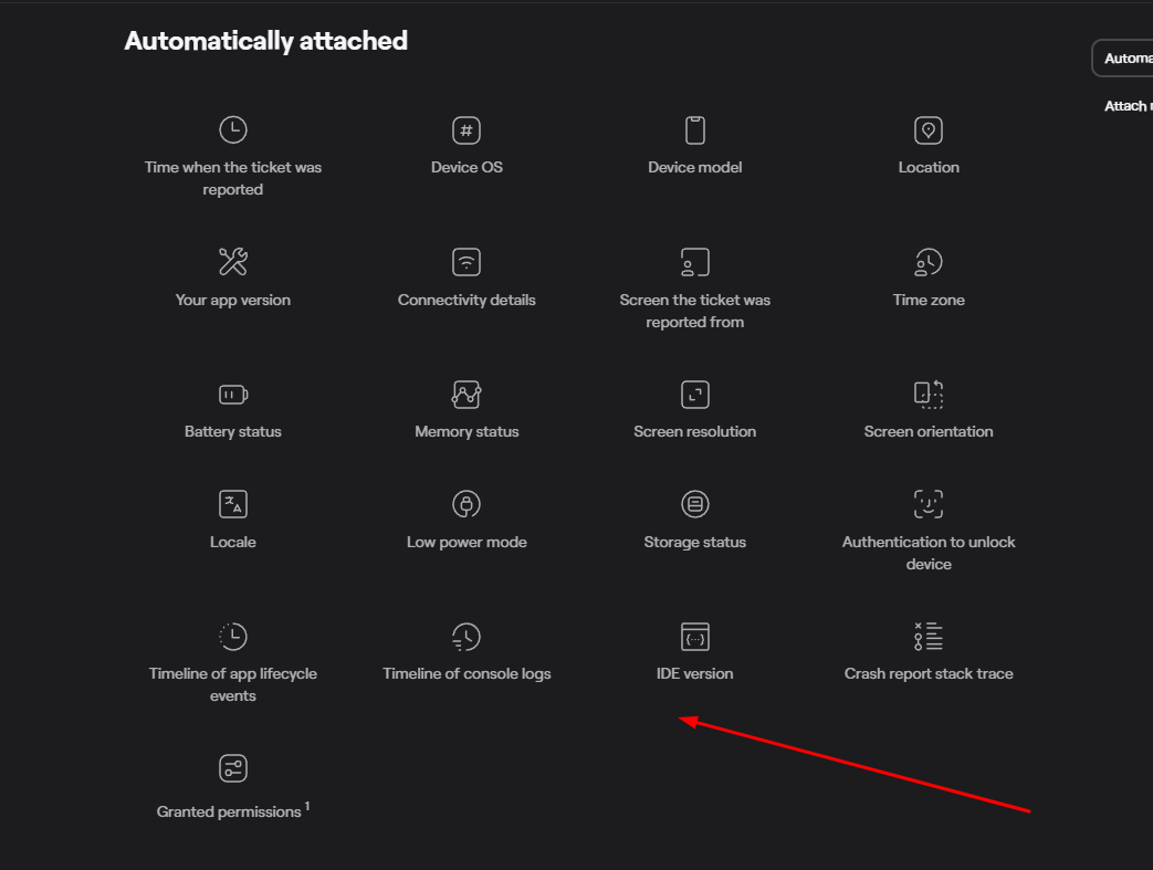
This approach not only streamlines the feedback process but also offers a broader understanding of the feedback within a larger framework.
Therefore, if you want the users to provide their insights frequently, you should remove barriers and simplify the feedback process.
By doing so, you’ll increase your chances of obtaining truly useful feedback from a larger pool of users.
Ask for feedback at the right time
In-app feedback allows you to capture user insights while the users are engaging with the application.
However, this process has some drawbacks as well as advantages.
Imagine the following situation: users are fully immersed in using your application when suddenly they are bombarded with irritating pop-up windows that nag them to rate the app.
Naturally, these interruptions hinder their seamless use of the app and become an annoying nuisance.
Zoltan Kollin, a design principal at IBM Cloud, puts it this way:
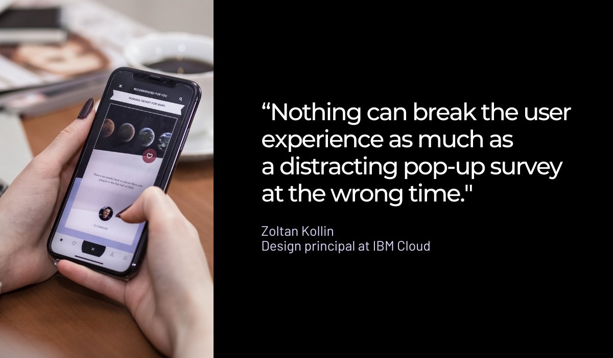
This leads us to a pivotal question. When is the optimal moment to request feedback from users?
In the article quoted above, Alexandre Gorius, a senior mobile growth consultant, believes that collecting feedback after a moment of satisfaction with the app can skew the results.
Users tend to provide biased and excessively positive feedback in such cases.
Instead, it’s important to wait until their initial excitement subsides and they’ve had the opportunity to explore the app.
Similarly, he advises against collecting feedback too early when the users aren’t yet familiar enough with the app’s features to form a constructive opinion.
According to Gorius, the ideal time is after the completion of a key action—a successful sale, for instance.
James Montemagno, the creator of My Cadence, an app which connects the user’s cadence sensor for indoor cycling to the app and visually displays it on the app’s screen, shares a similar viewpoint.
Montemagno has discovered an effective approach—he prompts feedback from users after they have successfully linked their sensors to the app on five separate occasions and subsequently pressed the “stop” button.
This strategy ensures that users have enough opportunities to interact with specific features of the app over a period of time.
He explains this strategy as follows:
The logic here is that users that are repeat users of the application must like it enough to keep using it and are more likely to leave a review.
By targeting users who consistently use the application, the team behind My Cadence has a better chance of receiving feedback from those who genuinely appreciate its value.
Therefore, the optimal timing would be to wait until users participated in a few sessions and completed an action, task, or level within the app.
This way, they can provide more insightful feedback, and they won’t be as bothered by pop-up windows.
Keep your questions to the point
According to a study conducted by Microsoft Canada, our ability to maintain focus has taken a downturn to the point where it’s now shorter than that of a goldfish.
This study was carried out among a group of 2000 young adults from Canada, and its findings shed light on the impact of technology on our average attention span.
In the year 2000, we could sustain focus for a solid 12 seconds, but now this ability has diminished to a mere 8 seconds.
While some may question the study’s validity, the fact remains that when seeking feedback from users, there is limited time to capture their attention.
Hence, it’s vital to avoid subjecting them to irrelevant, lengthy, and tedious questionnaires since they are likely to decide within a few seconds whether to participate in the survey or ignore it altogether.
To ensure user participation, it’s crucial to be concise and straightforward, as lengthy surveys are the primary culprit why people tend to abandon them.
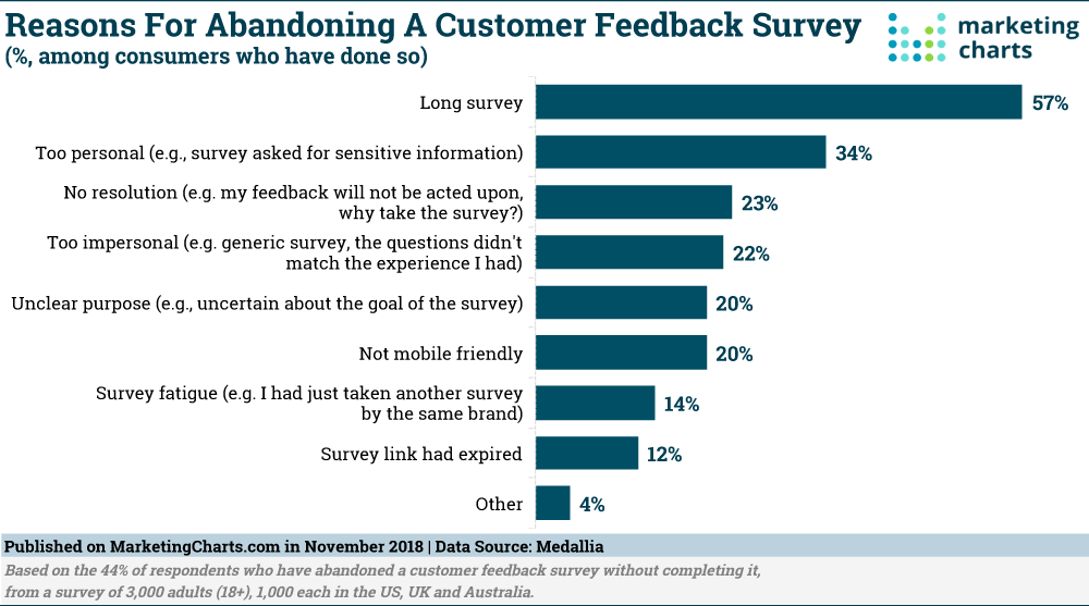
When creating survey questions, it’s important to ensure they are focused and directly related to the objective at hand.
In other words, it’s a good idea to ask questions that offer potential solutions.
For example, instead of simply asking, “Are you having any difficulties using the application?” you can ask, “How could we improve your experience?”
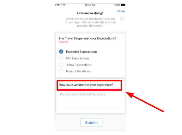
This approach provides more specific insights into enhancing the application and meeting the needs of users.
However, to ensure the survey is truly relevant, it’s recommended to incorporate different question types.
For instance, you can start with multiple-choice and yes/no questions to gauge user satisfaction with the app.
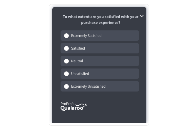
While these questions are easier to answer, they may not always provide the insights needed for a more comprehensive analysis.
Therefore, complement them with open-ended questions that encourage users to really explain what they think needs improving in the app.
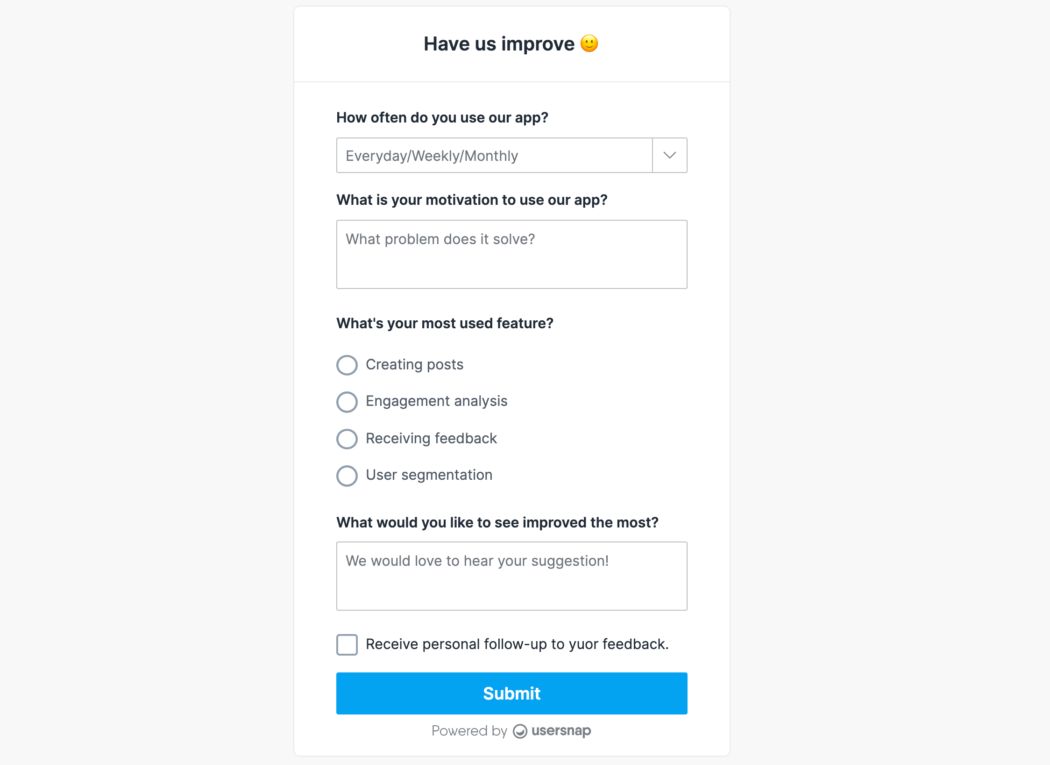
This approach will elicit more insightful suggestions that can better assist you in refining your app and gaining a deeper understanding of the context behind users’ responses.
For example, if users express extreme dissatisfaction with the app, open-ended questions can uncover the underlying reasons that simple yes/no or multiple-choice answers may not reveal.
Therefore, the right mix of short and relevant closed-ended and open-ended questions enables you to gather a diverse range of feedback and gain a comprehensive view of user experiences and preferences.
Respond to the feedback you receive
When users share their suggestions, they not only provide valuable insights but also devote their time in the process.
It’s paramount, therefore, to acknowledge and appreciate their contributions.
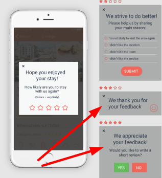
At the very least, make sure to send automated confirmation messages or notifications to inform them that their feedback has been received.
However, the true challenge arises when a continuous stream of feedback comes your way.
This is where the true necessity emerges—the need to organize and categorize the feedback before taking further action.
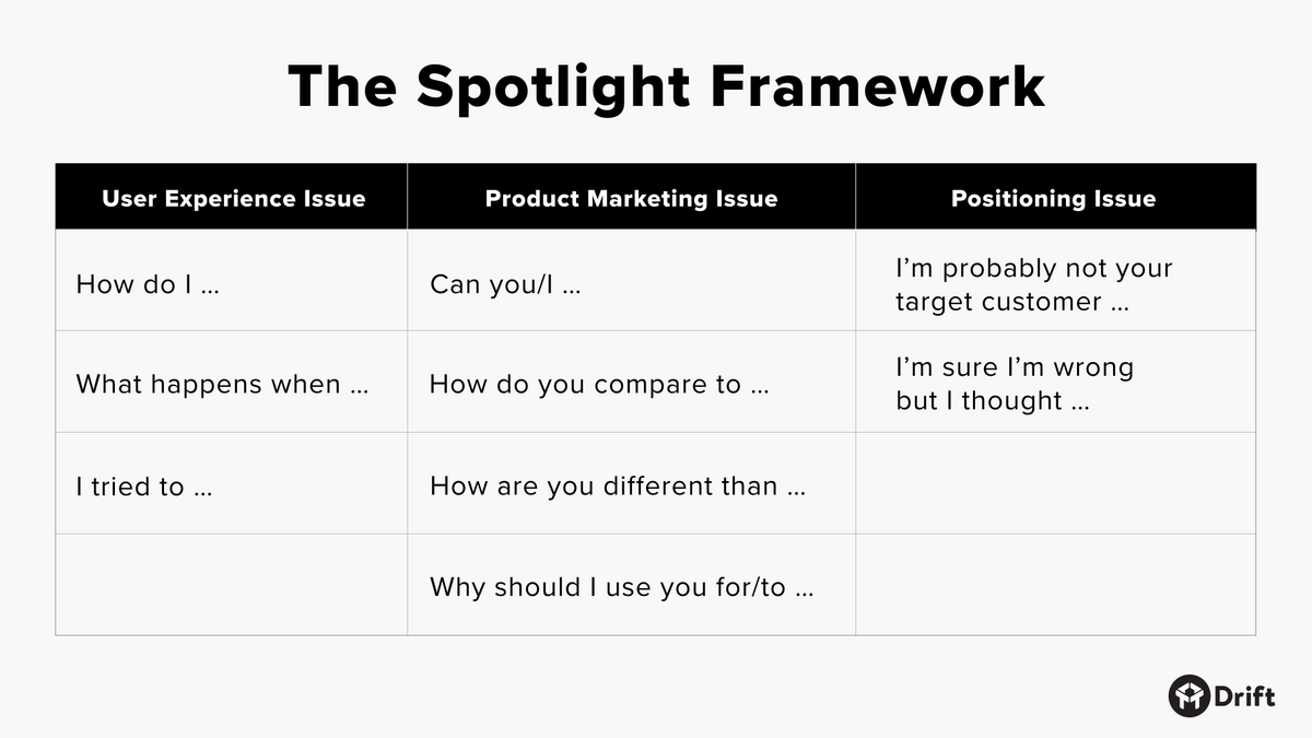
The Spotlight Framework, a nifty system of categorization created by Drift’s CEO, David Cancel, can assist you in this undertaking.
Here’s how it works.
The framework focuses on classifying feedback into three primary areas: user experience issues, product marketing issues, and positioning issues.
It carefully examines the initial words and phrases used to classify the feedback, indicating that the essential aspect of the process lies in asking the right questions.
Imagine if a user asks, “How can I invite my friends to use the app?”

Very handy for handling user feedback. CTOs, devs, testers – rejoice.
In this scenario, the user is aware of the ability to invite friends but lacks knowledge about the process.
This indicates a user experience issue that requires improvement.
However, if the user asks, “Can I invite my friends to use the app?”, the question suggests a lack of proper understanding about the app, indicating a product marketing problem.
Alternatively, if a user expresses uncertainty about being the target user, it indicates a positioning problem.
This way, you can precisely pinpoint the specific issues at hand, identify recurring patterns within the responses, and assign team members to address these concerns.
Equipped with these insights, you can then determine how to demonstrate to your users that their opinions carry weight and that you value them.
This principle applies equally to positive and negative feedback.
For instance, if users have displayed interest in a particular feature, consider inviting them to be beta testers for that feature or informing them when it becomes available in the app.
Also, never underestimate the significance of negative feedback, similar to the example in the image below.
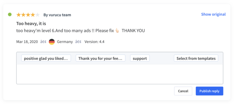
These users may be on the verge of giving up, but with the right follow-up and a personal approach from your support team, you have the potential to retain them as loyal users.
Depending on their level of dissatisfaction, you could offer a free month of service or inform them when the issue has been resolved.
In any case, by acknowledging their contributions, you not only create a positive user experience but also foster trust and loyalty.
And that is certainly worth considering.
Conclusion
In-app feedback isn’t something you do just once. It’s an ongoing process that drives the enhancement of app features and the overall app itself.
By applying the four tips described in this article, you will be able to maximize in-app feedback and reap the rewards it brings.
And remember, consider in-app feedback a gift given to you by your users.
So, don’t take it lightly. Take the time to explore the responses provided by your users, and don’t forget to express appreciation for their contribution.


