
In today’s user-centric world of mobile apps, user feedback is the lifeblood of app development success,
But if users are being asked for feedback all the time, they’re much more likely to ignore these requests.
That’s why, the best way to get it is while they’re using the app.
In-app feedback provides users with a direct channel to communicate their experiences, report issues, and share their perspectives.
These valuable insights empower developers to enhance app performance, address user concerns, and shape the app in line with user needs and preferences.
On that note, here are five strategies you can use to encourage users to provide in-app feedback.
Table of Contents
Create a compelling CTA
A compelling call-to-action (CTA) can inspire users to provide feedback while using the app.
Naturally, CTAs are not used only to invite users to give feedback but to prompt users to take a specific action, such as sign up, add an item to cart, book or buy something, start their free trial, share content, or get help.
As such, CTAs are a fundamental element of mobile app design, usually present as a noticeable button.
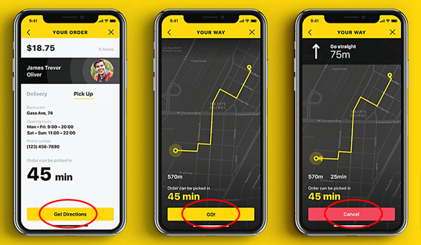
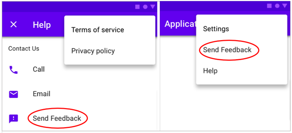
When it comes to feedback CTAs, they can be prominently featured on your app’s interface, such as a dedicated button or a sidebar, but are often found in the app’s home menu and/or as a timely popup window.
That way the app’s interface remains clutter-free and user-friendly, and feedback options are readily accessible when users need them without causing distraction or visual overload.
Of course, your feedback CTA should be clear and concise and fit the type of information you’re trying to collect.
For example, if you wanted users to rate their overall app experience, they could get a well-timed popup window after they complete a certain action. It can pop up when an exit intent is detected, for instance.
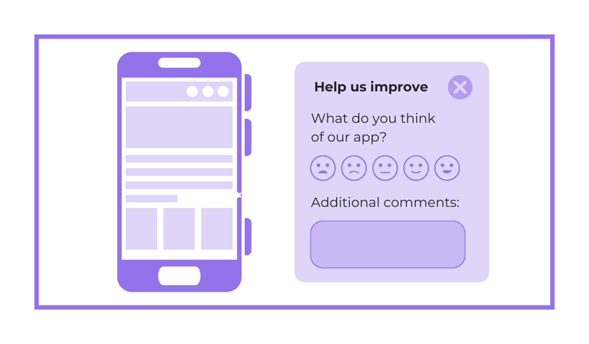
In that case, your CTA can have the copy “Help us improve” followed by a simple question and an even simpler rating system while leaving room for more specific user comments.
This is enough for users to give at least their general rating of your app.
However, if you wanted to collect more specific feedback, such as on a recent app update, your CTA might remain the same, but the question and popup timing will be different.
In this case, the question could be something like “How do you like our latest app version?” and a popup would be triggered after they’ve installed the update and used the app for a while.
So, what makes in-app feedback CTA compelling?
There’s a range of factors to consider, some of which we’ll cover in later sections, like design, profiling, and incentives.
The other top factors for great feedback CTAs are:
- Clarity: users should immediately understand what you’re asking them to do
- Relevance: CTAs appear when contextually relevant to the user’s journey within the app
- Non-intrusiveness: users should be able to provide feedback when they want to
To recap, a great feedback CTA encourages users to take action, share their thoughts, and provide valuable input.
It can be a button, an icon, a popup message, or any textual or visual element that invites users to share their experience.
Therefore, making your feedback CTA compelling enough for users does not depend only on the words used, but on—as we’ll see next—the design of in-app feedback.

Get unreal data to fix real issues in your app & web.
Make the design visually appealing
Making the design of your in-app feedback prompts visually appealing is essential for capturing users’ attention and encouraging them to share their thoughts.
In addition to clarity and conciseness, there are other design elements to consider, such as using contrasting colors to make your in-app feedback stand out from the rest of the app’s interface.
For instance, consider using vibrant buttons with a color that sharply contrasts with the background, so users are drawn to it.
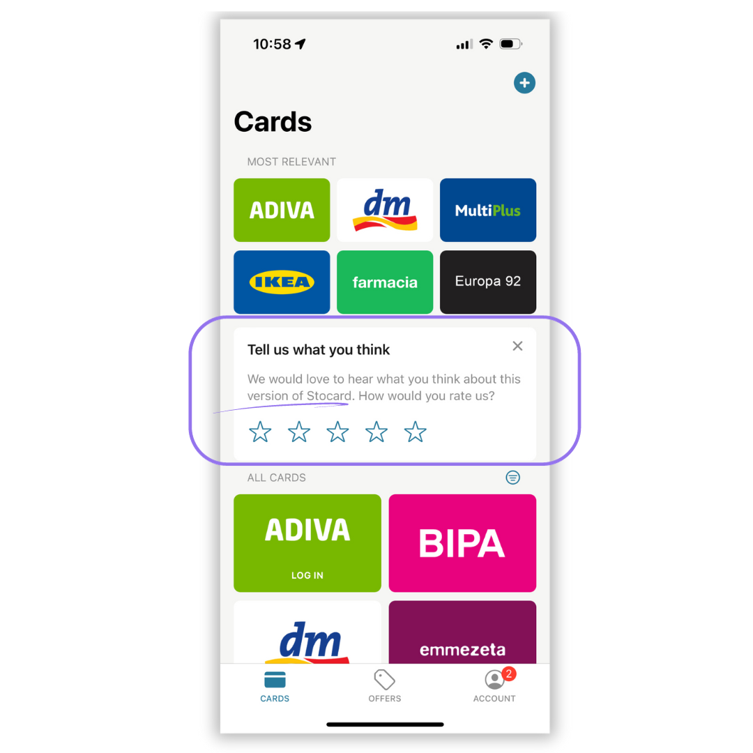
As you can see in the example below, another design element to consider is whitespace, i.e., leaving enough free space around the feedback prompt so it doesn’t feel cramped or crowded within the app’s interface.
Next, the size and placement of your in-app feedback button play a role in its visual appeal.
Consider placing the feedback button in a prominent yet unobtrusive location, ensuring it doesn’t obstruct core app functionalities.
At the same time, the button should be large enough to be tapped with a finger on a smartphone screen.
Overall, one of the guiding principles of designing any CTA buttons or icons is to keep the visuals simple and intuitive.
In fact, you might opt to minimize the visual clutter of your app’s interface by employing a shake-to-send feedback function like the Google Maps mobile app does.
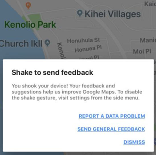
This type of minimalist design in-app feedback keeps the user’s attention on the app’s core functionality while allowing them to easily share their thoughts without leaving the app.
If you’re afraid users won’t know how to do that, use your app’s onboarding tutorial to explain that all users need to do to give feedback is shake their phones.
This is also a great way to collect bug and crash reports from app testers and early adopters, as well as general feedback from the broader audience.
And to amp your app’s feedback capabilities even more, you can integrate our bug reporting widget Shake into your mobile app.
It will enable users to provide qualitative feedback about an issue they encountered, suggest improvements, or ask questions.
See how it looks in action:
Simultaneously while enabling app users to share their opinions, Shake will automatically capture a range of quantitative data that will give app developers valuable information about the reported issue, such as the device’s operating system, model, and location, and your app’s version and connectivity details.
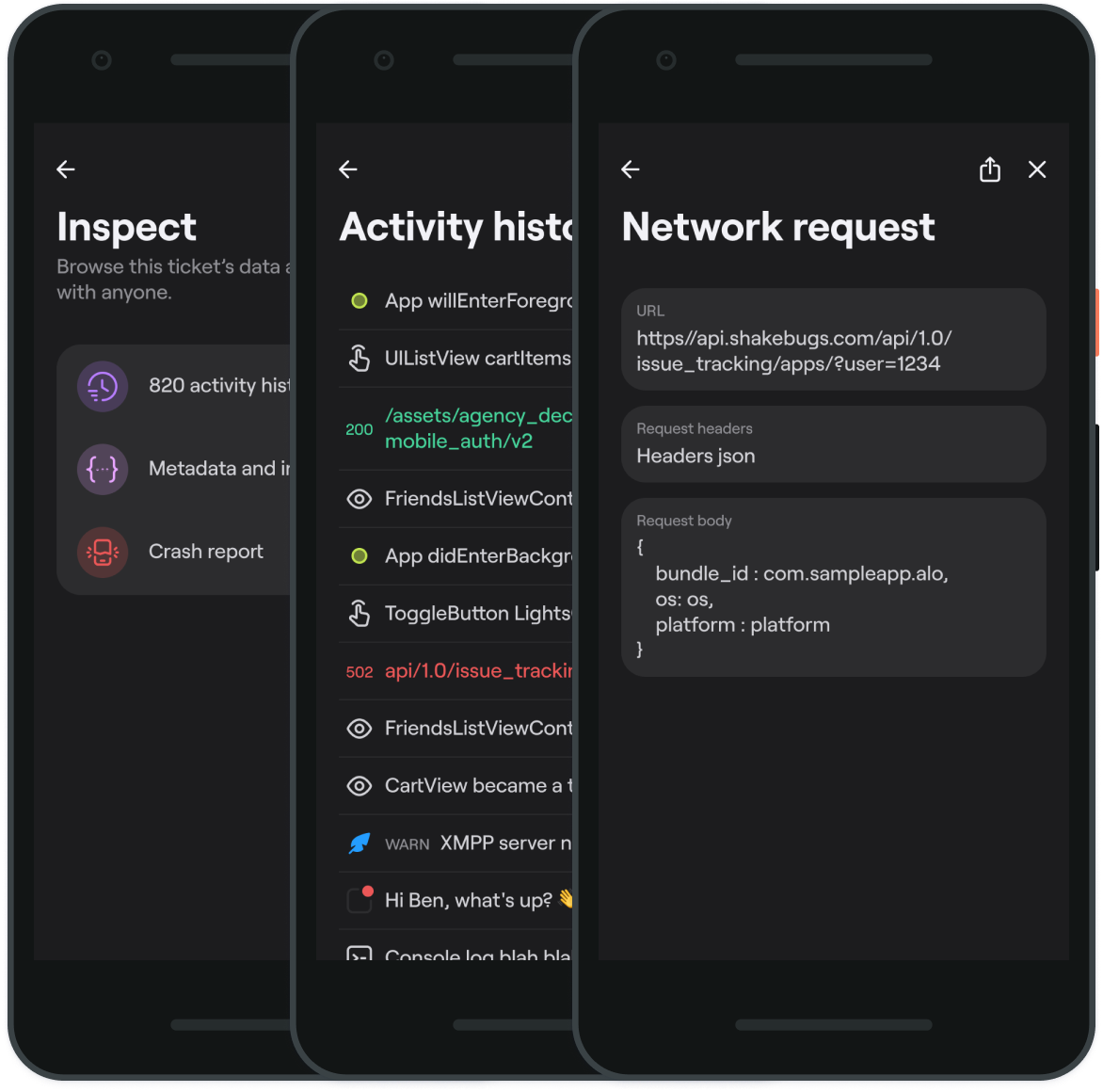
Naturally, when using shake-to-send-feedback, you should still keep the feedback option prominently displayed in your navigation menu for those users who want to give information in that way.
Overall, making the design of feedback options visually appealing while not overcrowding your app’s interface is another great way to encourage users to provide in-app feedback.

Use progressive profiling
In the context of in-app feedback, progressive profiling refers to the practice of gradually collecting more detailed information from users over time, rather than overwhelming them with extensive forms or questions all at once.
It’s a user-friendly approach that respects users’ experience and preferences while respecting their wish not to overshare personal information when interacting with your app.
When a user is initially asked for feedback, you could start with a simple rating or a single-choice question that minimizes the user’s effort and time investment.
As the user continues to engage with the app and provides feedback over multiple sessions, you can gradually request more detailed information.
For instance, after the user has rated their overall experience, you might follow up with open-ended questions or specific feedback related to a recent interaction.
The below example shows this gradual feedback progression.
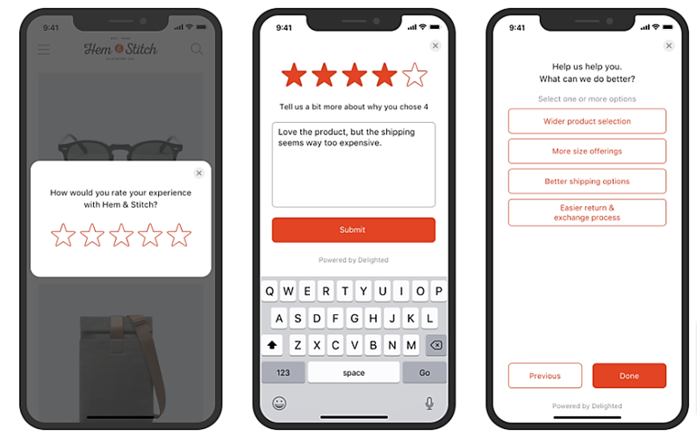
Another aspect of progressive profiling in in-app feedback involves tailoring questions based on user behavior.
For example, if a user frequently interacts with a particular feature, you might ask for feedback related to that feature specifically.
This makes the questions more relevant and increases the likelihood of developers collecting higher-quality responses on more specific aspects of the app.
To recap, progressive profiling is all about not overwhelming your users with a barrage of feedback questions but staggering them in a non-intrusive and user-centric way to increase the user response rate and get more in-depth, specific insights.
Offer incentives
Motivating users to provide in-app feedback can sometimes require a little extra encouragement, and that’s where offering incentives comes into play.
Incentives can be powerful tools to boost user engagement and participation in your feedback collection efforts.
Providing feedback takes time and effort.
Therefore, recognizing this by offering incentives is a way of acknowledging and appreciating your users’ contributions to improving your app.
Different incentives, such as gift cards, discounts, reward points, or early access to new app features, can be particularly effective for encouraging users to share detailed feedback.
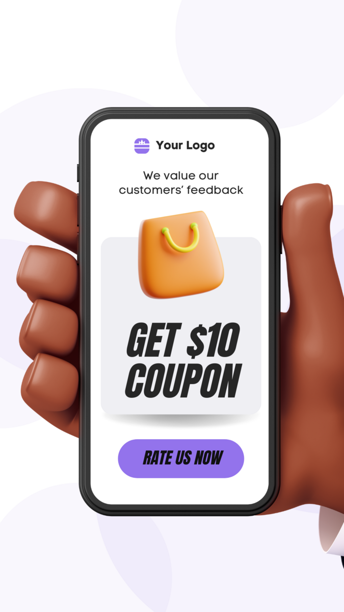
For instance, you can organize feedback contests or giveaways, where users can participate by providing their input.
This not only boosts engagement but also creates a sense of excitement.
Alternatively, you can implement a point-based system where users earn points for each feedback submission.
Many gaming apps do that, by offering extra coins for rating the app positively.
Likewise, providing early access to new app features or perks to users who actively participate in feedback campaigns can turn ordinary users into app advocates.
In summary, incorporating incentives into your in-app feedback strategy can turn occasional contributors into active participants.
By acknowledging and rewarding their contributions, you not only collect valuable feedback but also foster a sense of community and loyalty among your users.

Very handy for handling user feedback. CTOs, devs, testers – rejoice.
Implement the feedback
Recognizing users who provided feedback is only a part of the equation for encouraging feedback.
But another equally important factor is acting upon the received feedback and informing users you’ve done so.
In other words, implementing user feedback in a timely and effective manner will not only foster future user engagement but also create a sense of partnership between developers and users.
This is crucial to keep users engaged and, most importantly, avoid online comments like these:
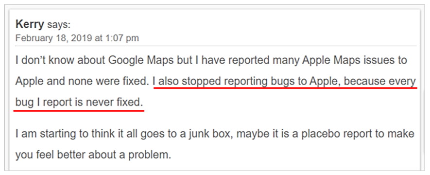
Put simply, such comments can make even the best feedback-collecting plans much less effective as they discourage other users from participating.
Conversely, when users report bugs and developers take prompt action to fix them, this motivates them to report a bug or another issue again, thus enhancing user engagement and retention.
Moreover, such swift fixes (along with recognizing feedback that initiated them) demonstrate that user feedback is valued and helps create a more reliable app, which can lead to positive user reviews and app recommendations.
For instance, if users consistently provide feedback about a specific feature being too complicated, developers can work on simplifying it in the next app update, making the user experience smoother.
Another example is when users suggest new features or improvements.
We at Shake enable our users to do that and to upvote each other’s suggestions.
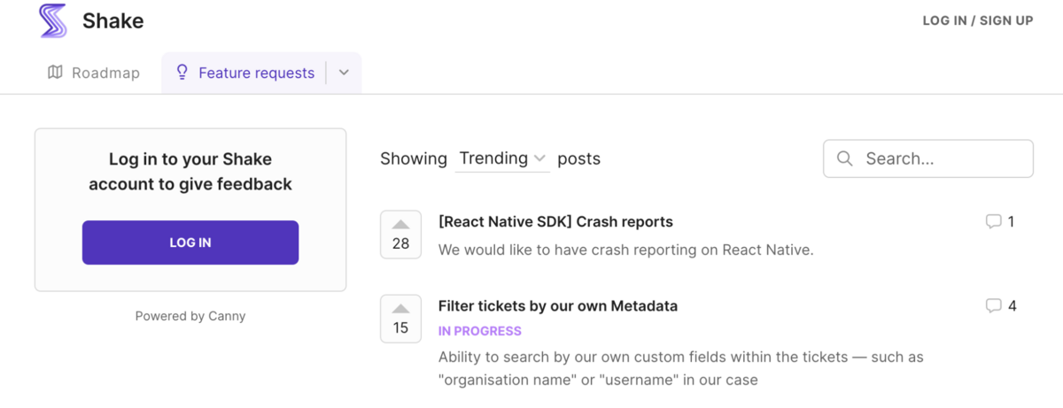
By implementing these suggestions, developers can expand your app’s functionality and meet user demands, which can be a significant factor in attracting and retaining users.
In conclusion, recognizing the received feedback and implementing it creates a positive feedback loop where users feel heard and appreciated, leading to improved user experience and loyalty.
Conclusion
So, from creating a compelling call-to-action to implementing user feedback, it’s clear there’s a lot that goes into encouraging users to provide in-app feedback.
Considering how feedback (or a lack thereof) can make or break your app, you should carefully consider these strategies and decide which will inspire users to provide actionable feedback in line with your needs and their preferences.
That way, you’ll be able to quickly fix issues, introduce relevant improvements, and optimize your app’s performance while maximizing user satisfaction based on in-app feedback.


