Collecting feedback is a cornerstone of app management, as it’s through feedback that you get insights into user experiences, preferences, and areas that require enhancements.
Feedback guides improvements and innovations that align with user expectations, so optimizing the process of collecting this invaluable information is key.
One of the most user-friendly and efficient methods is capturing in-app feedback, a strategy that ensures user convenience and real-time data acquisition.
In this article, we will unveil the top six ways to capture feedback within your app to help you get started with this practice.
We first dive into the world of feedback widgets.
Table of Contents
User feedback widget
One popular and effective method of collecting feedback is through the use of widgets.
Feedback widgets are interactive elements embedded within an app that enable users to easily and quickly provide their thoughts, experiences, and suggestions.
These widgets are typically activated when a user voluntarily clicks on a designated button within the app.
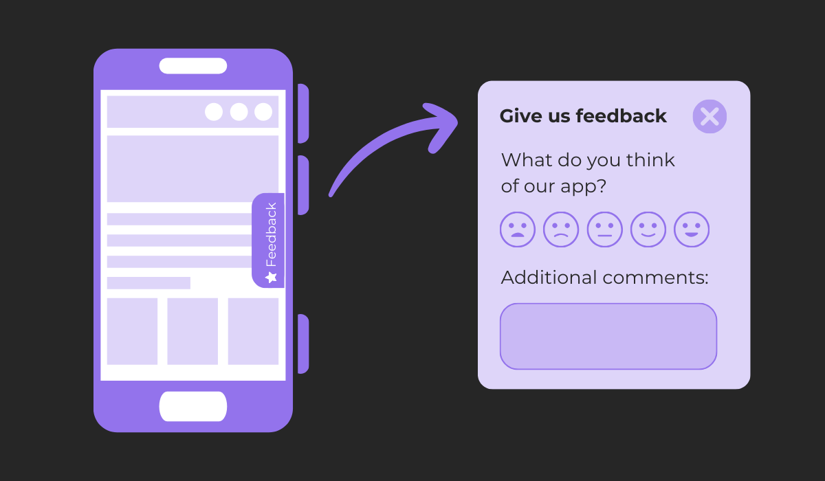
In the example above, the widget pops out when a user clicks on a side tab.
However, other implementations include a button that remains permanently visible on each app screen or is located within the app’s settings page.
For collecting transactional feedback, these widgets can be programmed to automatically pop up after specific user actions, offering insights into experiences with particular app functionalities.
However, use this practice sparingly to avoid disrupting the user experience.
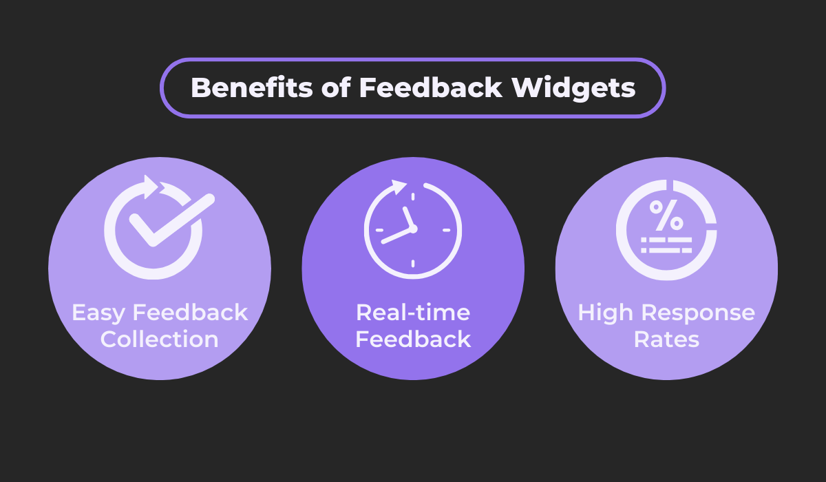
This feedback collection method has a number of advantages, three of which we highlight below.
They offer convenience as users can provide instant feedback without the need for additional steps like sending an email or filling out lengthy online forms.
Also, the ever-present nature of the feedback button ensures that the users can instantly relay their thoughts whenever they encounter an issue or think of a suggestion, leading to real-time feedback and higher user response rates.
Overall, feedback widgets are an essential part of in-app feedback collection. If you need an easy way to get real-time and organized feedback, this method is the right one for you.

Get unreal data to fix real issues in your app & web.
Shake-to-send feedback
While widgets are an invaluable tool, let’s take a look at another, more innovative way to get feedback,
Let’s say you were aiming at a more minimalist app design where a feedback button just wouldn’t do, but you still wanted the benefits of feedback widgets.
In this case, you would want to go with a feature like shake-to-send feedback.
This solution is unobtrusive but still effective, as you don’t affect the app interface but still have an immediately accessible feedback solution.
This feature is offered by our very own tool, Shake.
After adding the Shake SDK into your app in a few simple steps, users can instantly provide feedback or bug reports from anywhere within the app.
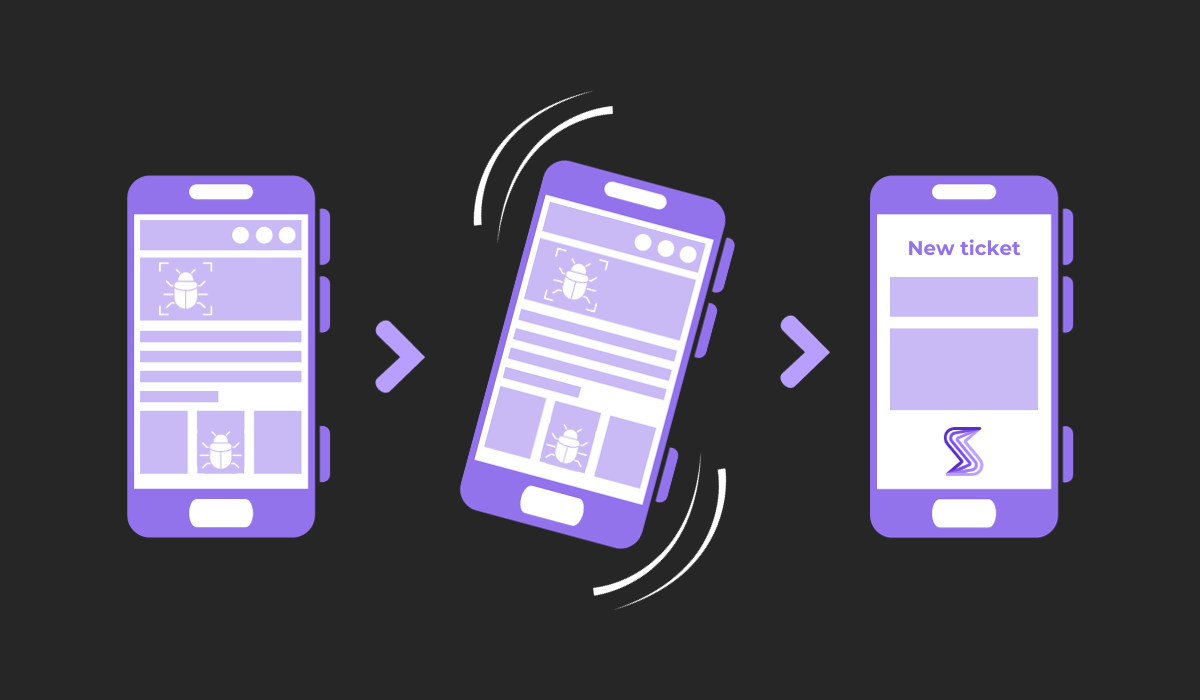
When a bug is detected, or users think of some feedback, they can just shake their device, which opens up a new ticket right then and there—helping capture their immediate thoughts and experiences with the app.
To illustrate how this functionality works, imagine a user encountering a user interface bug like the one shown below.
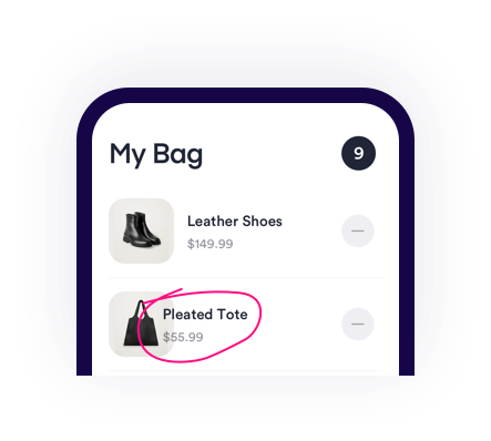
Without closing the current screen and potentially losing important information about the issue, they would simply shake their device and be prompted to pick what type of feedback they want to send.
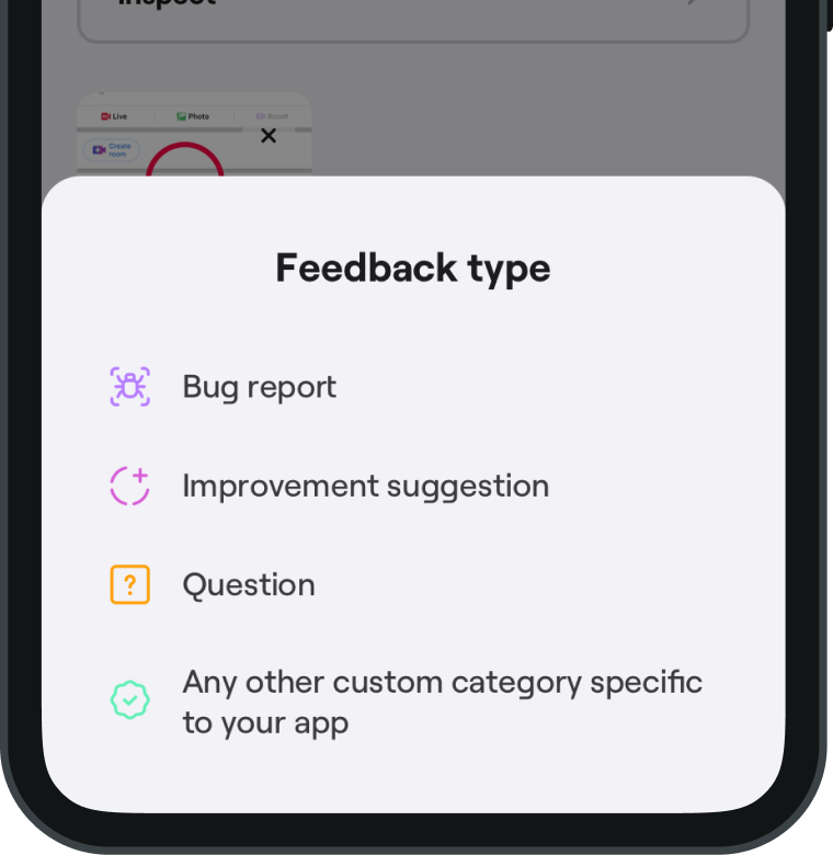
The image above shows Shake’s default options for selecting the type of feedback being provided.
This option can significantly improve how feedback is organized for efficient analysis and make feedback collection more user-friendly.
After the feedback type is selected, users are directed to a new ticket screen that’s intuitive and straightforward.
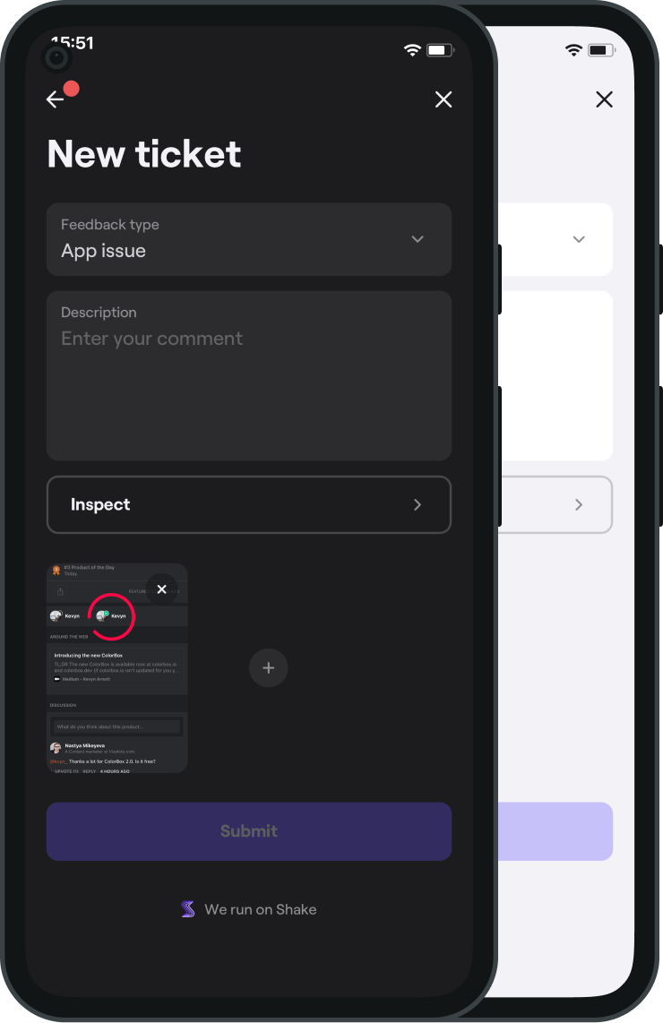
There, they can highlight specific areas on the screen where the issue occurred and add their comments.
But don’t let this simplicity fool you.
Shake can automatically collect over 70 metrics of data in a single bug report to provide developers with comprehensive insights.
This data is especially useful during beta testing of an app, enabling more effective debugging and speeding up the app’s release.
In conclusion, shake-to-send feedback is a great blend of simplicity and efficiency, respecting the app’s design while enabling quick feedback collection.
User satisfaction survey
Switching gears, let’s delve into the realm of in-app surveys, a more structured yet equally effective method of gathering user feedback.
One popular type of in-app feedback collection method is the user satisfaction survey.
These pop up occasionally or are triggered when a user interacts with a new feature.
To maximize the response rates and the quality of feedback, adhering to some best practices is essential.
These include the following:
- Let the respondent know how long the survey will last
- Show the number of questions
- Keep it short
- Add a progress bar
- Minimize the required fields
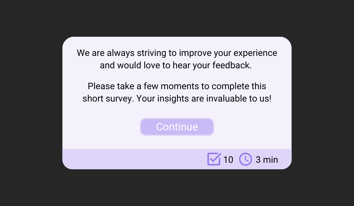
For starters, a friendly and concise message, like the one shown above, can potentially increase participation rates. Transparency about the survey’s length and question number sets clear expectations, encouraging users to share their thoughts.
As for the survey questions, they should be carefully selected to get all the necessary information you need without overwhelming your users.
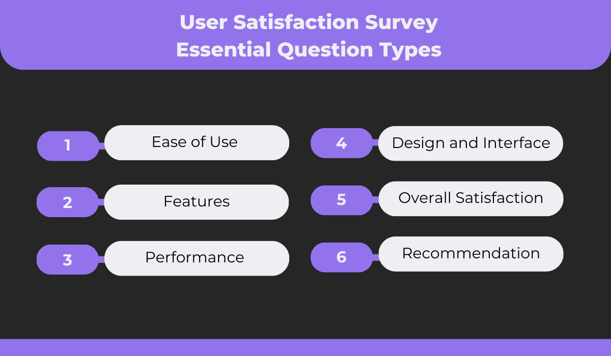
The image above shows a balanced mix of some question types you might include in a survey for assessing an app as a whole or for some of its specific aspects.
Including one to two questions per type should be more than enough.
An example of what a well-structured and straightforward user satisfaction survey looks like is shown in the following screenshot.
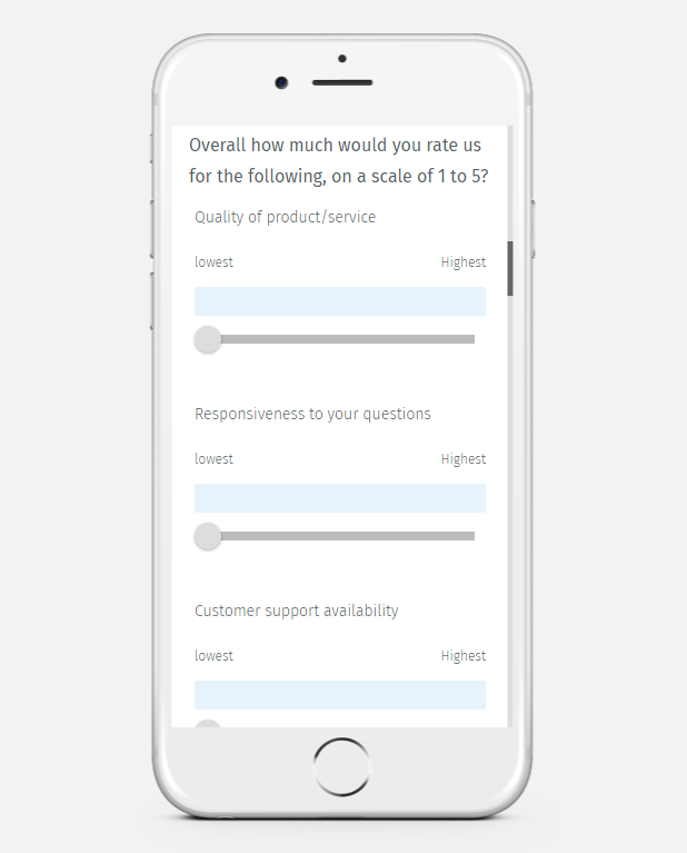
As you can see, user satisfaction is often measured using a sliding or numerical scale for each question, where the lowest option means being the most dissatisfied and the highest the most satisfied.
User satisfaction surveys are a goldmine of insights when executed effectively.
They offer a structured way to collect a wealth of information, enabling app developers and managers to pinpoint what an app is doing well and opportunities for improvement.

NPS survey
Staying on the topic of surveys, let’s explore another much shorter but equally effective survey.
We’re talking about the Net Promoter Score (NPS) survey, which is essential for assessing the popularity and success of the app.
Word-of-mouth referrals are critical for the success of any business, and 90% of people believe brand recommendations from friends.
This information means that knowing the likelihood of an app’s user base recommending the product to others is an excellent indicator of the app’s potential for growth.
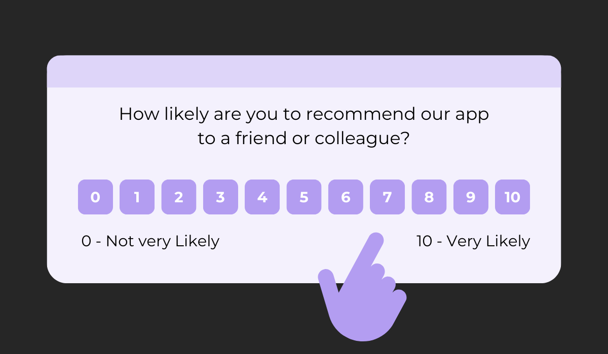
An NPS survey typically consists of a single, straightforward question, as illustrated above. Users are asked to rate on a scale of 0-10 how likely they are to recommend the app to others.
This simplicity means you can expect higher response rates, which is good news.
Based on the responses to the survey, customers are placed into three categories shown below.
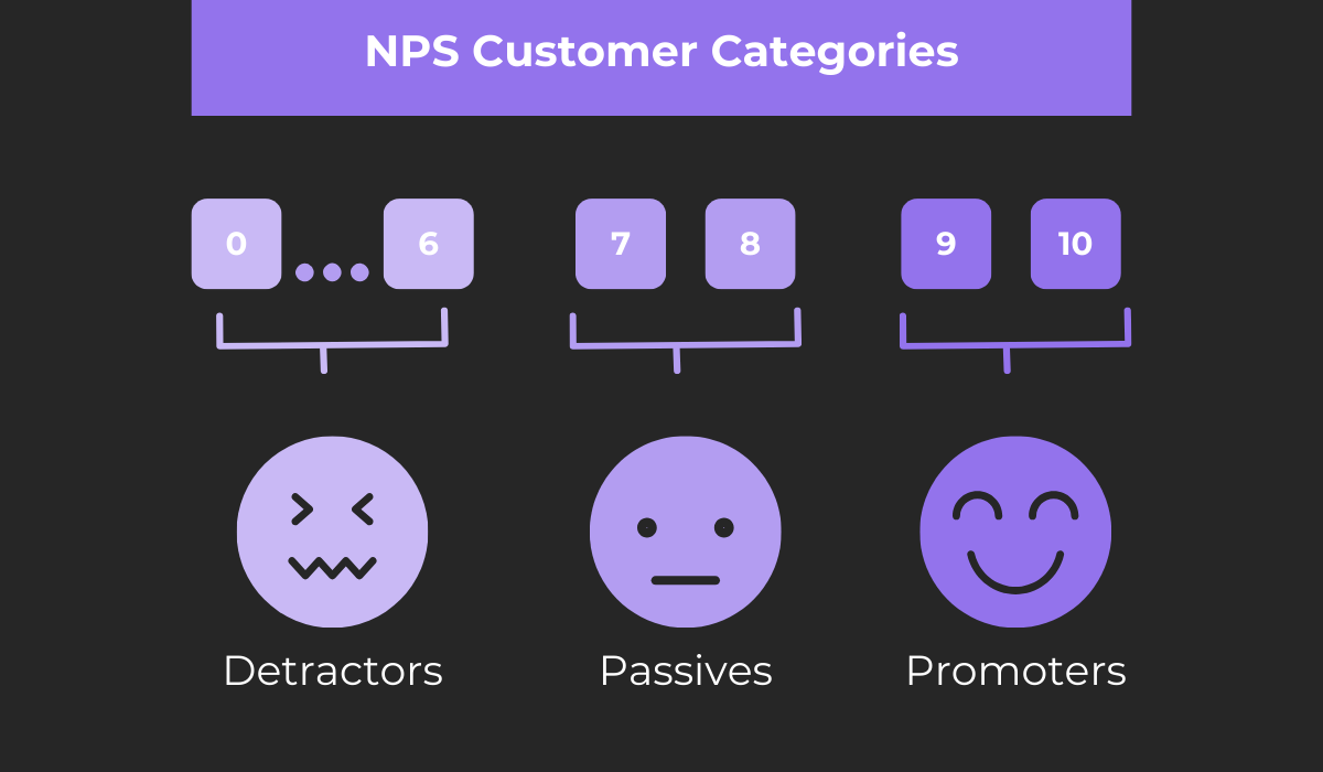
These include promoters, passives, and detractors, and the number of users being in a specific category offers distinct insights.
Promoters are loyal enthusiasts who support and advocate for your app, so having more of them means you’re doing well.
Passives are satisfied yet unenthusiastic users who might need a little push to become loyal.
Finally, there are the detractors.
They can be dangerous, as they can do harm to your brand and, consequently, hinder the growth of your business. In essence, they are those unhappy customers who create poor reviews of your business and generate bad word-of-mouth.
To turn both those categories into a single measure you can keep track of, you can calculate the NPS.
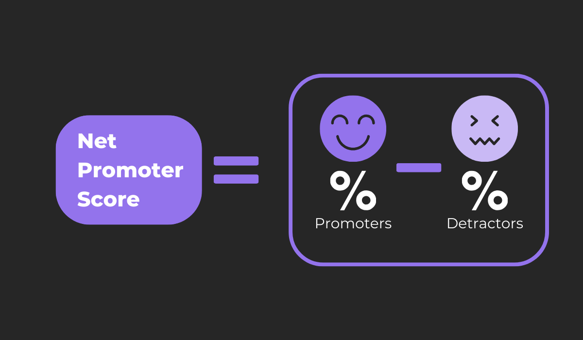
Doing so is very straightforward. The NPS is derived by subtracting the percentage of detractors from the percentage of promoters, offering a clear metric to gauge overall user satisfaction with a product and their brand loyalty.
The following is a general guideline for what you can consider good absolute NPS scores:
- Above 0 is good
- Above 20 is favorable
- Above 50 is excellent
- Above 80 is world-class
In conclusion, NPS surveys offer a quick, efficient means to gauge user loyalty and the likelihood of your app being recommended, serving as a valuable metric for what users think of your app and its growth potential.
In-app chat
Moving away from surveys, we have a more direct and interactive approach to collecting feedback—the in-app chat.
This feedback collection method is as straightforward as it sounds.
An app can feature a chat button that, when pressed, opens a screen where users can interact directly with representatives of your organization that offer immediate responses and personalized help.
This immediate form of communication is highly favored by users for its efficiency and convenience.
As the data above suggests, the majority of users prefer this method of communication over others, and this holds true for feedback collection as well.
According to users, the reasons for the overwhelmingly positive experience with live chat are the following:
- Questions being answered immediately
- Ability to multitask
- Most efficient communication method
- Receiving better info than through email
To ensure a positive user experience with in-app chat, it’s essential to have a user-friendly chat interface.
The chat screen should be simple and intuitive, encouraging users to engage and share their feedback or seek assistance.
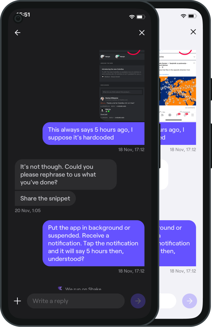
Moreover, the availability of representatives is crucial.
The essence of in-app chat is real-time communication, so having someone readily available to respond to users’ inquiries is fundamental to its success.
In a world where immediacy is highly valued, in-app chat stands out as one of the best ways for feedback collection.
The direct line of communication between users and organizations enables immediate resolution of issues and makes the users feel their concerns and suggestions are heard and valued.
So, set up an in-app chat and foster connections with users while you collect valuable insights.

Very handy for handling user feedback. CTOs, devs, testers – rejoice.
App rating prompt
Finally, let’s delve into the app rating prompt, a simple yet highly impactful tool for gathering user feedback.
We’ve all encountered these prompts, which are a small pop-up asking us to rate the app, typically on a scale of one to five stars.
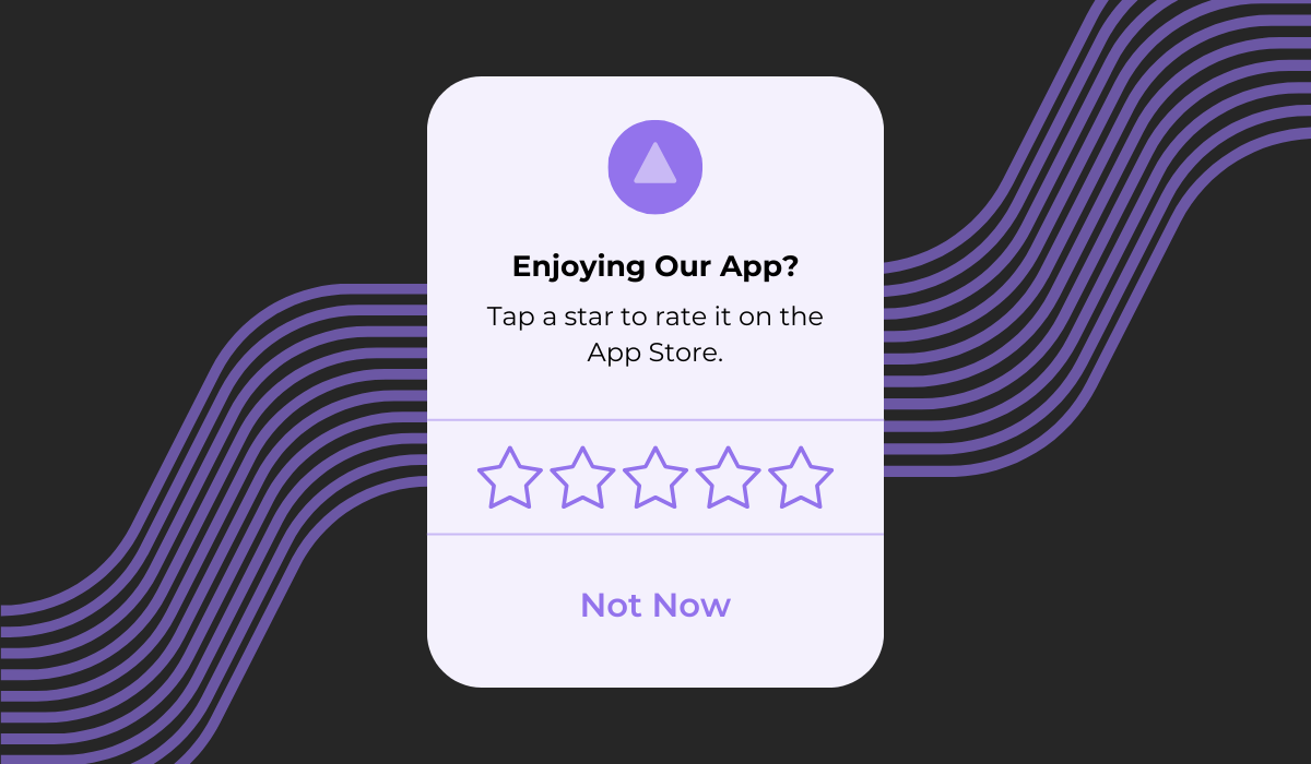
But with all the detailed feedback collection methods we’ve discussed, why does a simple star rating matter so much?
The answer lies in its public nature and visibility.
These ratings aren’t just for internal use. They’re displayed prominently on app stores and review sites, influencing potential users’ decisions to download the app.
In fact, when users are browsing through apps, they often consider the following factors before deciding whether to download an app:
- Average user ratings
- App ranking for relevant search queries
- Number of downloads
Remember how we said users trust brand recommendations from friends and family?
Well, these rankings and reviews act similarly and collectively contribute to the app’s perceived value and reliability.
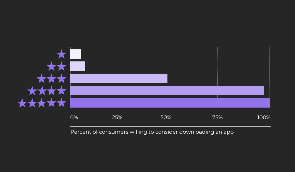
The data from Alchemer in the image above underscores the significance of app ratings.
Ideally, an app should aim for four or five-star ratings, as even a three-star rating can deter half of potential users from trying it out.
If low ratings start pouring in, it’s crucial to delve deeper, gather more detailed feedback, and identify areas for improvement. Every star counts, and enhancing the user experience can significantly uplift the app’s rating.
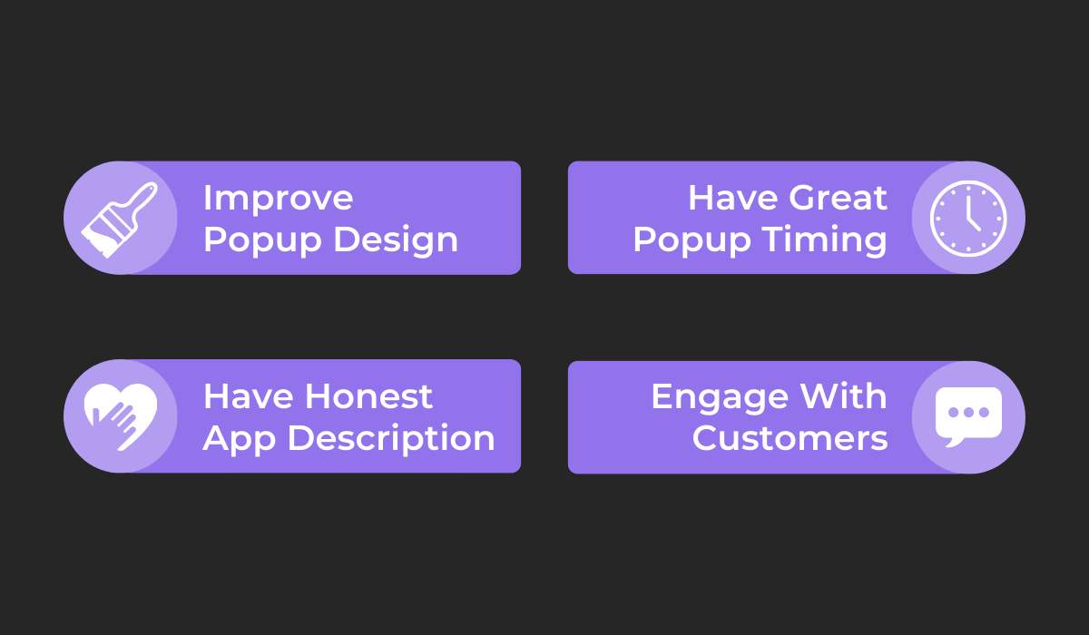
However, the team at CallApp discovered that even the design and timing of the app rating prompt can influence users’ responses.
Their insights are depicted in the image above and concern strategic adjustments to the prompt’s design and timing, aligning the app description with its actual functionality, and engaging with dissatisfied customers.
By following these practices, CallApp managed to increase its Google Play ratings by 80% and reduce negative feedback by 70%.
In essence, while the app rating prompt might seem simplistic, it plays a pivotal role in public perception and the app’s overall success, making it an indispensable feedback collection tool.
Conclusion
With that, we are done exploring the six best ways you can capture feedback inside your app.
From feedback widgets to surveys, in-app chats, and rating prompts, each method offers a distinct way to get invaluable insights directly from each of your users’ experiences.
You’re now equipped with a richer understanding of these methods, their benefits, and some practical tips to effectively use them for your app.
Remember, every piece of feedback is a stepping stone toward perfection, and with these tools, you’re well on your way to creating an app that is enjoyed by many.

