
When developing an app, it’s easy to overlook the importance of usability testing.
As the development teams get caught up in all the tasks that need to be done, it can seem like a small detail in the grand scheme of things.
However, if you want to create an app that’s easy for people to use, you need to test it before releasing it.
Because the mobile app market is crowded, having all the usability bells and whistles in place can make a big difference.
This guide will tell you everything you need to know about usability testing and how it can help make apps become more user-friendly.
Table of Contents
What is mobile app usability testing?
During app development, you may assume that your eyes can tell you everything you need to know about how to make it better.
After all, usability is a subjective thing, right?
But then, you run a usability test with end users and discover that they’re having trouble with the app’s most basic functions.

Get unreal data to fix real issues in your app & web.
That’s why mobile app usability testing is so important—it’s one of the best ways to ensure that the app is easy to use and meets user expectations.
But before we go any further, let’s first define what exactly usability testing is.
In a nutshell, it’s a very popular and valuable UX research method that allows developers to find out how easy (or difficult) it is for the end users to use an app.
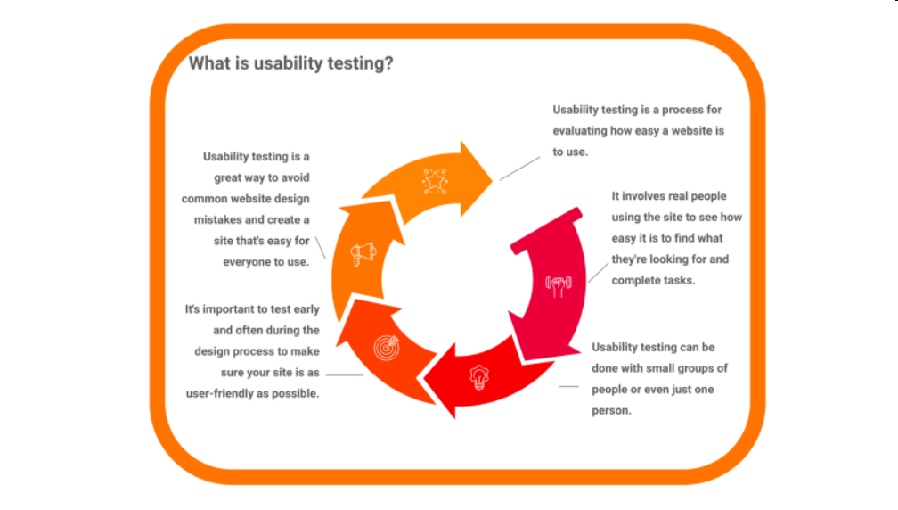
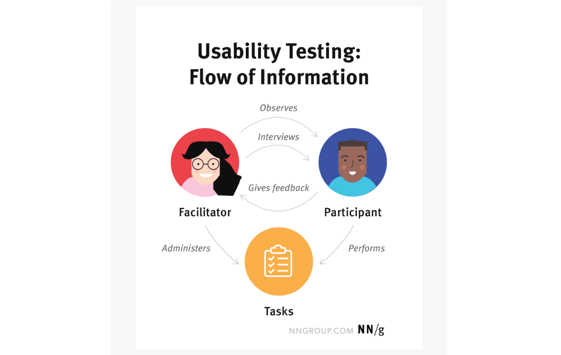
In usability testing sessions, researchers, also known as facilitators, ask participants to perform specific tasks using mobile apps.
As they complete each task, facilitators watch for clues in their behavior and listen for feedback.
That way, they can identify any usability issues that might need to be addressed.
Usability tests are usually performed in the middle or end of app development, using a prototype or minimum viable product, but they can also be done during wireframing.
In fact, wireframing is one of the best times to gather user feedback since developers can incorporate it into their work before much coding has taken place.
Now that we’ve covered the basics of usability testing, let’s dive into more detail.
Why is usability testing important?
Although you can, to a great extent, create a user experience that seems intuitive and easy to use on your own, you still need feedback from real users to fine-tune the app.
Usability testing is one of the most important methods you can use to get that feedback.
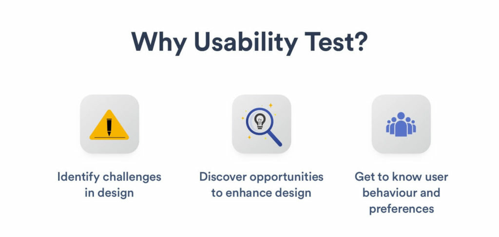
That is so because, during usability testing, you can uncover the following:
- Problems in the design
- Opportunities for improvements
- Behavior and preferences of the target audience
For example, a good usability test will tell you where the application falls short.
What do people find confusing about the app? Where do they get stuck? What errors do they encounter while using it?
All these important questions can be answered during this process.
In addition to helping developers detect problematic areas, usability testing can enable them to identify opportunities for improvements too.
For example, if users don’t understand what a button does when they first see it, perhaps the developers can make that function clearer.
Finally, usability tests can provide valuable information about how users actually interact with the app—information that could prove to be crucial for future development.
Let’s take Udemy as an example. Udemy’s stakeholders initially thought users preferred to use their mobile app while on the go. However, the usability testing proved that assumption wrong.
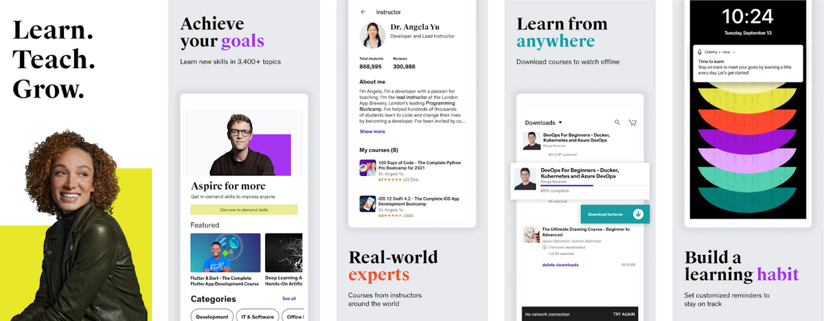
Instead, it found that users tended to use the app most often when they were staying in one place, like a workplace cafeteria during lunch or on a couch at home.
This information formed the foundation for their future app versions.
This example perfectly illustrates the value of usability testing during app development.
It allows teams to gain a better understanding of how users experience the app, and then use this information to improve it in the next iterations.
How to perform mobile app usability testing?
Usability testing is a broad and nuanced topic, and there are many steps that should be taken into consideration to ensure that it’s successful.
First and foremost, it’s important to set goals. Then comes identifying the tasks needed to achieve those goals and devising a methodology for carrying out each task.
Once that is done, facilitators should gather the participants who will be involved in the testing, perform it, and then analyze the output data to see whether it matches up with what was expected.
But without further ado, let’s get into the nitty-gritty of each of these steps and look at the best practices to follow.
Set the testing objectives
When preparing the stage for usability testing, the first step is to determine its objective.
Setting goals isn’t something that should be taken lightly, as it will affect almost every aspect of testing—from planning how many participants are needed to deciding what kind of questions might elicit meaningful data from them.
For a better idea of what objectives might look like in practice, let’s take a look at an example from the Nielsen Norman Group, which set the following goals for one of their usability testing processes:
- Find articles on a specific topic
- Sign up for UX Week seminars
- Learn about our consulting services
As you can see, setting objectives isn’t the easiest thing to do as it requires a lot of planning and forethought.
Fortunately, Michael Margolis, a UX research partner at Google Ventures, has created an easy-to-follow method that makes this task much simpler.
In his blog post, Questions to ask before starting user research, Margolis outlines a six-step process that can be used to create objectives quickly.
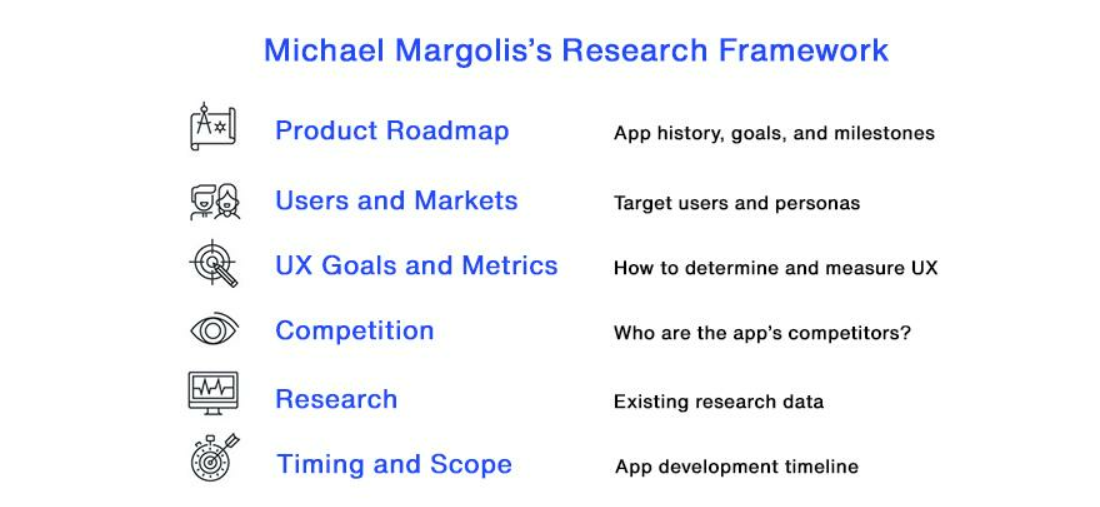
As you can see in the picture, it actually acts as a checklist that helps you identify any gaps in the app’s development.
For each aspect of the checklist, you can ask questions to define what the team already knows and what is still unclear.
By answering these questions, the team will have a clear vision of what needs to be tested and be able to identify goals that will drive the usability testing process.
Determine the tasks for testing
With objectives in place, the next step is to define tasks.
Typically, tasks are short sentences that describe what action a test user should perform—for example: Register an account., or Sign in to your account.
However, some researchers suggest that giving a task such a concise form may make participants feel like they’re being tested, which would prevent them from answering questions as they would in the real world.
Marieke McCloskey, director of UX research at LinkedIn, is one of those researchers.
For that reason, she not only calls tasks activities in front of participants but also recommends setting up scenarios that put them into context.
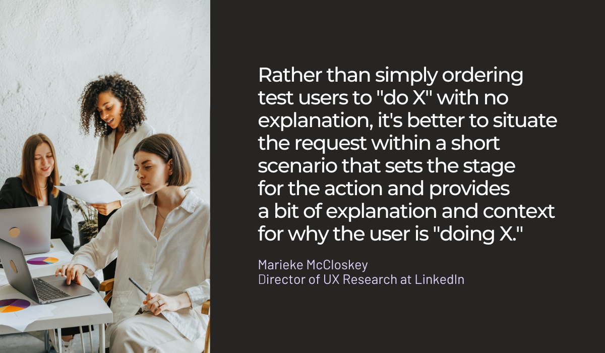
An example of a task scenario could be:
You’re planning to go on a business trip to San Francisco and you need to book a hotel. Go to the Expedia and Kayak websites and see who offers better prices.
Tasks that are too concise or even poorly written can force users to interact too much with a specific feature, making the results of the usability testing somewhat inaccurate.
On the other hand, scenarios such as in the example above provide context for the tasks, which helps users to focus on performing them in the same way they would in their everyday life.
In light of these considerations, the best tasks are the ones that are reasonable, actionable, and don’t reveal any clues on how to perform them.
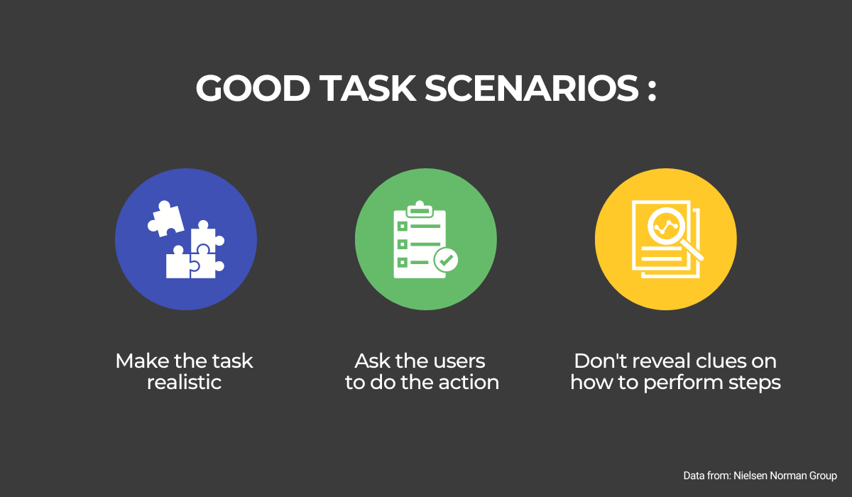
That basically means that they’re representative of a real-world task, request that participants perform an action, and make sure not to give away the solution.
In this way, the user can focus on performing the task rather than trying to figure out what facilitators want from them or feel like they’re being tested.
Decide on the testing method
Choosing the testing methods is one of the most important steps in mobile app usability testing.
There are many different options available, and each has its own pros and cons, so let’s examine some of the most popular ones and see how they stack up against each other.
First, usability testing can be done in a moderated or unmoderated format.
In moderated testing, the moderator controls the flow of a session by asking questions throughout.
With unmoderated testing, the participants are left to their own devices and, when they’re done, report back with the issues they’ve encountered.

Moderated testing provides direct feedback from users, but it is costly and time-consuming.
Unmoderated testing, on the other hand, is less expensive but doesn’t provide as much insight into how people actually use the app.
Another decision you have to make is whether to do it remotely or in person.
The difference between those two is obvious—remote testing is done over the internet, while in-person testing requires the facilitator and participants to be in the same physical location.
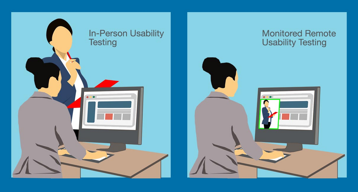
Remote testing allows for more participants to be involved in the process, but it can be difficult to ensure that they’re following directions correctly.
In-person testing is the most effective, but it’s also more expensive and time-consuming.
Plus, since the facilitators need to be in the room with participants while they use the app, it’s hard to scale the testing process.
Finally, there is structured and exploratory testing.
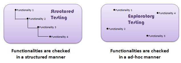
Structured testing is called that way because it guides the participant through what they should do step-by-step.
The benefit of this type of test is that it produces consistent results, which makes them useful for evaluating specific features.
Exploratory testing allows users to explore the app in their own way and style, making it an excellent method to find bugs and errors in the UX.
These methods can be used in different combinations to create a variety of usability test types, including guerilla testing, lab testing and card sorting.
Of course, the teams will choose which testing approach is best for them based on their specific needs and the type of app they are building.
Gather the participants
After defining objectives and tasks and deciding on the method, the next step is to choose the test users who will participate in the testing.
As a rule of thumb, it’s best to include users whose demographics and other characteristics match the app’s target audience as closely as possible.
For example, if the app is intended for young people, it’s best to include users in their teens and early twenties.
If it’s, for instance, geared towards middle-aged women, it would be better to focus on those between 35 and 55 years old.
An excellent approach here would be to design user personas to identify what types of people will be using the app.
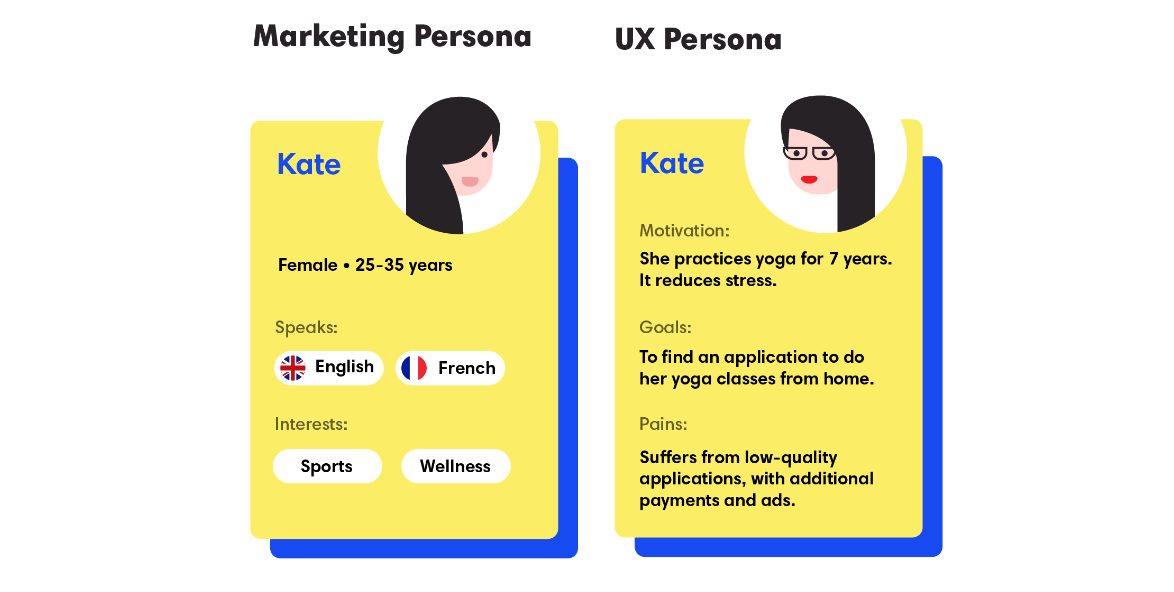
To create a more detailed profile of potential users, it’s advisable to describe their gender, age range, marital status, education level, personal traits, motivation, goals, and lifestyle.
User personas created this way can be used as an effective tool for sourcing and recruiting participants.
The next step is deciding how many people will participate in the testing.
The size of the testing group can significantly affect both the budget and the time spent gathering meaningful results, so it’s important to consider these factors carefully.
So how to determine the perfect number of participants?
The Nielsen Norman Group, for example, says that testing with five people enables development teams to detect almost as many usability problems as using more test users.
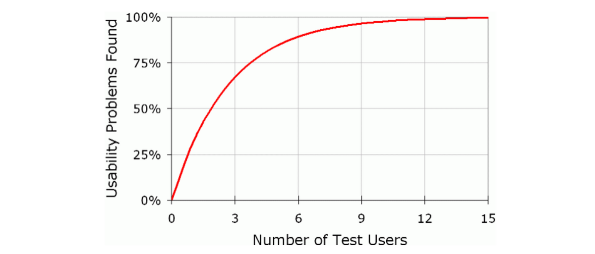
The underlying logic of this 5-user rule is that more participants aren’t likely to reveal more insights.
In fact, it’s more probable that they’ll mention the same usability issues—and at a higher cost!
So it’s best to test just enough participants whose feedback will give a good understanding of how the app works for users.
There will, of course, be situations when much more than five participants will be needed.
For example, mobile e-commerce apps can be more complex than regular ones, so testing with a small number of participants may detect only 35% of their usability issues.
However, starting small, with a limited number of test users in the first round of testing is often a good approach to take.
Do the usability test
With the list of participants in place, it’s time to perform the actual test.
To ensure that the usability testing will be successful, the facilitator will need to decide which moderating technique is the most appropriate for the situation.
There are various techniques to choose from, including concurrent and retrospective think-aloud, as well as concurrent and retrospective probing.
For example, as the name suggests, in the think-aloud session the participants are asked to verbalize their thoughts as they go through the test scenario.

This allows facilitators to get a better feel for what’s going on in their minds and helps them instantly identify any usability issues with the app.
You can see in the YouTube video below what this looks like in practice.
This kind of testing can also be done retrospectively. When the session is over, the moderator asks participants to retrace their steps—often by watching a video replay, if available.
One drawback of both these techniques is that having to speak out loud might distract the users or make them complete the test more slowly than usual.
In that case, concurrent or retrospective probing might be a more appropriate technique, as here participants work on a task, and when they make an interesting remark, the facilitator asks them follow-up questions.
After choosing the technique, each session should have its own specific schedule to ensure that all tests run smoothly.
For example, Justin Mifsud from Usability Geek recommends the following agenda:
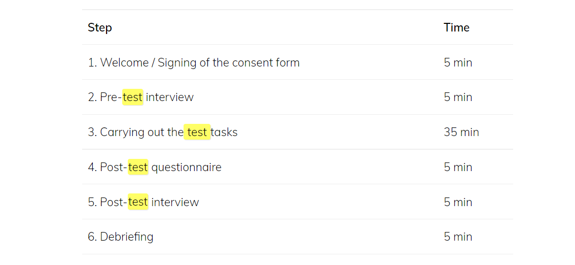
After starting with a quick introduction and signing the consent form, followed by a pre-test interview, participants should complete a task that’s about 35 minutes long.
Once this is done, in the post-test interview and debriefing phase, they should answer some questions about their experience and give feedback on the usability of the app.
After usability testing has been conducted, it’s time for probably the most interesting part—the analysis of results.
Analyze the test results
After the facilitator has collected usability data, they must be sorted, organized, and analyzed.
This is where the whole process becomes art as much as science, providing quantitative as well as qualitative data to guide development decisions.
However, as you can imagine, this work is never easy.
According to research, if development teams conduct regular usability tests with five to ten users, they often have to sort through reams of incomplete and confusing information—which can produce more than 60 issues per test.
For best results, however, it’s best to analyze the testing data through four stages: data collection, issue prioritization, solution generation, and solution prioritization.
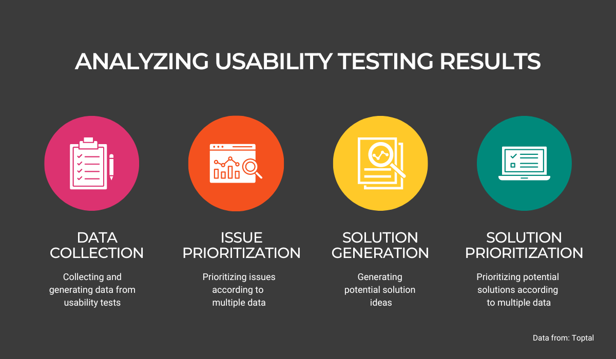
The first step is to collect data from usability tests. To do this, it’s important to structure and organize the data to avoid clutter so you can have clear insights later in the project.
A list of usability problems is usually prioritized by assigning a severity grade to each of them based on factors such as task criticality, issue frequency and impact.
Based on these findings, a list of recommendations and solutions is created.
And finally, the solutions should be prioritized according to some parameters, such as business value, complexity, and return on investment (ROI).
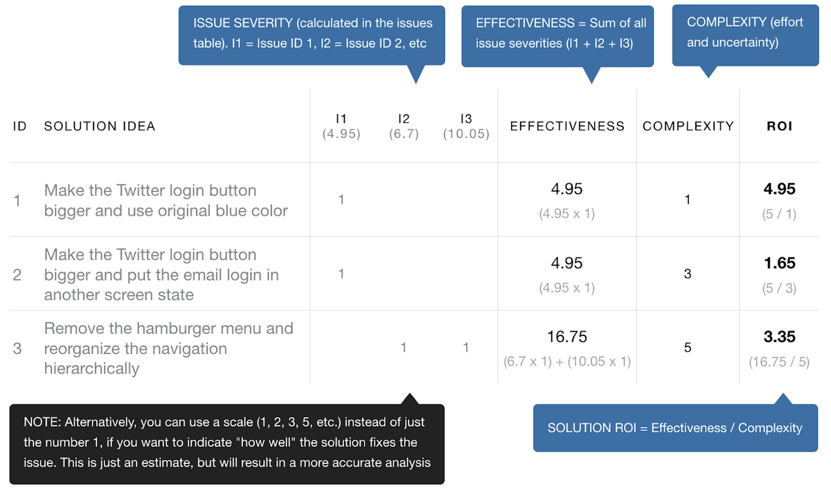
When development teams have all this information at their fingertips, the testing is over, and it’s time to start implementing the changes.
This is where the rubber will meet the road. With a clear view of the user experience, development teams will be able to build new features that give users a better user experience.
Conclusion
Despite the consensus among development teams that good usability testing is essential to the app’s success, many of them still don’t give it much thought.
The main reason for this is that usability testing doesn’t have an immediate ROI.
It takes time and money to plan, conduct, and analyze the results of a usability test, which means it can be difficult to justify it when compared with other development activities like feature development or bug fixes.
However, if developers don’t do usability testing, their assumptions about what users want from an app will likely be wrong, and this can potentially have serious consequences if not detected early, as we’ve seen in Udemy’s case.
This article will hopefully shed some light on the importance of usability testing and provide team leads with some valuable insights into how it can be done.


