If you want to ensure your app is intuitive, easy to use, and user-friendly, try implementing usability testing.
A testing variant that measures how pleasant using your app is, usability testing views the app from a user’s perspective to assess its worth.
As such, users almost always carry out this kind of testing themselves. Such an approach has multiple advantages and is well worth the hassle and cost of organizing it.
If you aren’t convinced, read this article. We’ve outlined all the benefits of mobile usability testing, so you can see why this type of testing pays off.
Table of Contents
Identifies problems with the app’s user journey
Designing navigation for mobile apps is tricky—apps are confined to a small screen yet must clearly display content.
The conventional solution is devising multiple screens, one per information chunk, therefore avoiding crowding everything on one screen.
However, this strategy requires your app’s user journey (or flow) to be intuitive and straightforward.
Users must easily find their way around your app, or they’ll get frustrated and confused.
Here’s a user journey example:
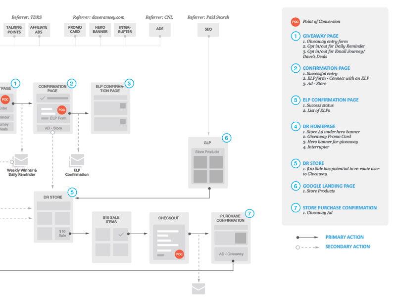
There are multiple pathways, meaning users can easily stumble down the incorrect route.
This is where usability testing helps—it will reveal these pitfalls.
By observing how users navigate your app, you’ll spot any unnecessary detours and realize what navigation paths require revision.

Get unreal data to fix real issues in your app & web.
However, when testing usability, avoid telling users exactly where to go. Instead, set a specific task, and see how they move inside the app.
Consider this task:
You have to reach Shake Bridge. Go to the tram schedule and look up when number 4 is arriving.
Almost every step is spelled out, meaning users will know precisely where to click. There isn’t much difficulty.
Here’s the same task differently formulated:
You have to reach Shake Bridge. Find the simplest way to get there and when you should be at the station.
This version uncovers much more. You’re not directing the user but allowing them to navigate the app freely in order to complete the task.
They’ll discover information independently, proving if the app is logical enough to be used without specific instructions.
It’s also hugely beneficial to employ usability testing before development begins, as tree testing has proven.
Designed to evaluate information architecture, tree testing asks users to locate a feature in your app’s screen hierarchy.
Here’s an example, in which users were tasked with finding the unsubscribe option.
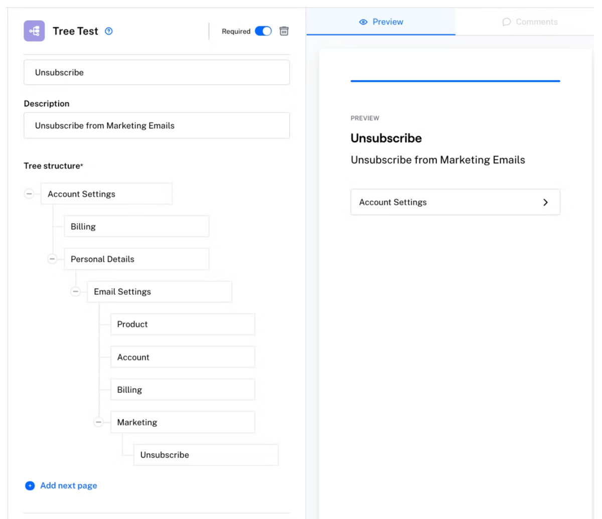
Depending on how quickly they find the feature, you can evaluate the intuitiveness of your app’s user journey.
If it takes most users longer than anticipated, it’s worth reconsidering your app’s architecture.
That’s the beauty of tree testing—you’ll uncover user journey issues before development, allowing you to immediately create an app with optimal usability.
Exposes the app’s usability issues
The benefits of usability testing don’t end with revamping the user journey.
This testing exposes multiple app usability issues, e.g., app learning difficulties, improperly implemented gestures, etc.
These problems are hugely important, as they contribute to user dissatisfaction—the opposite of how users should feel.
This is how David McQuillen described usability:
Usability is about human behavior. It recognizes that humans are lazy, get emotional, are not interested in putting a lot of effort into, say, getting a credit card and generally prefer things that are easy to do vs. those that are hard to do.
In other words, you should revise anything that turns out to be challenging to accomplish inside the app. Usability testing will help uncover these problems so that you can correct them.
The graphic below shows the main usability parameters:
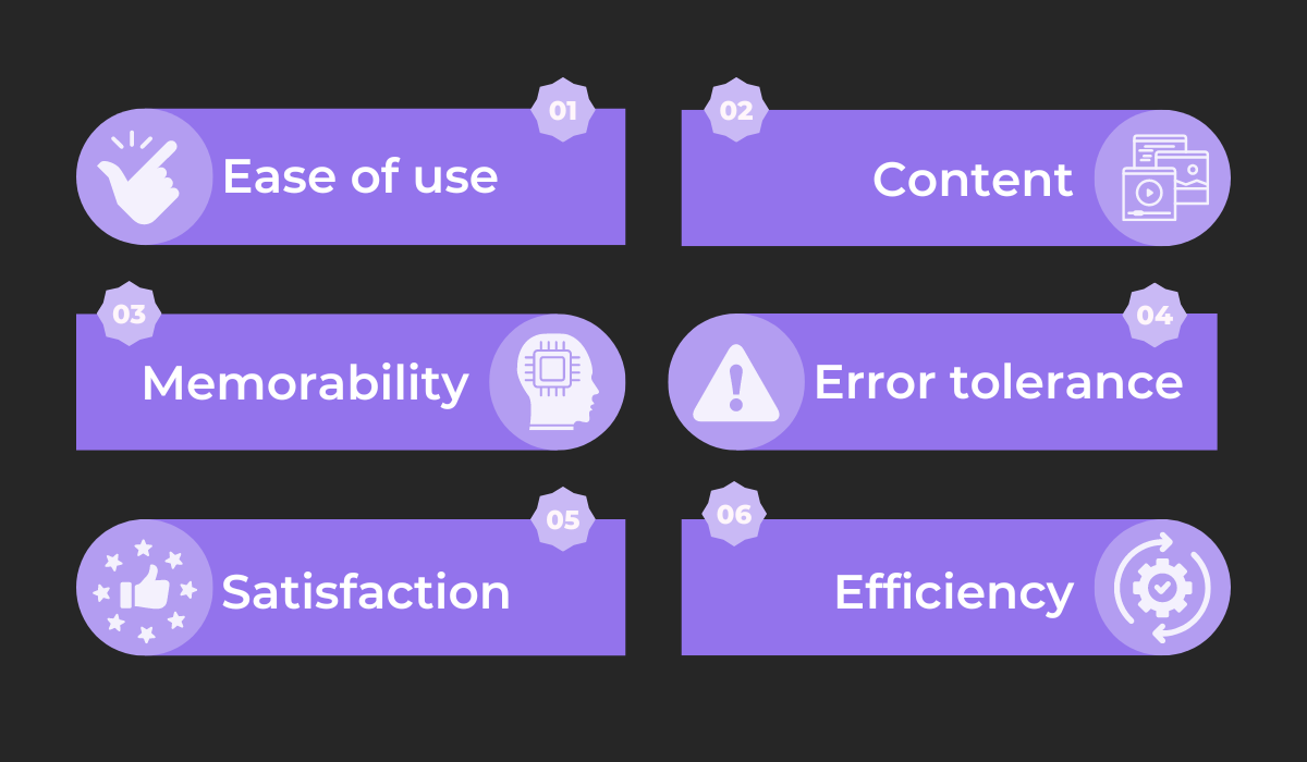
Ease of use focuses on the app’s learnability. If, when encountering your app for the first time, it takes the prospective user 10 minutes to create an account, the process should be reimagined.
Conte is also important, meaning that everything should be up-to-date. Imagine if your app contained multiple dead links—your users likely won’t be pleased.
Memorability measures how easily users remember the app’s operations after a break. If revisiting the help center is necessary to become proficient again, your app isn’t user-friendly.
Another important metric is error tolerance—how many errors users encounter and how they react. Usability testing reveals if the errors are well-handled.
Satisfaction, on the other hand, measures how pleasant using the app is. If users don’t enjoy using it, a re-design might be necessary.
Finally, efficiency monitors how quickly the users perform the tasks within the app. For example, when placing an order, the app should offer to save the credit card for future purchases.
One usability issue that encompasses multiple metrics concerns touch targets.
If users struggle to tap on too-small buttons, this increases the likelihood of errors and impedes efficiency and satisfaction.
This phenomenon is well-known as Fitt’s Law:
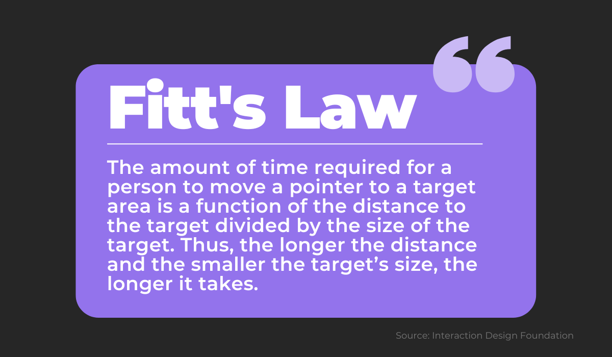
If your testing participants can’t click on the buy button due to poor sizing, this warrants fixing.
And this is only one well-documented usability issue—extensive testing will uncover more and therefore improve your app.
Saves valuable resources
Although usability testing helps uncover app issues, there are also broader advantages to it. Done correctly, this testing type can save you two valuable resources: time and money.
Most software nowadays is built according to the software development life cycle (SDLC), a procedure for outputting high-quality software.
Here’s the typical process:
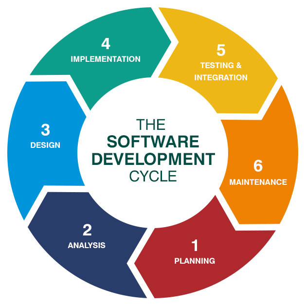
Although, generally speaking, testing constitutes the fifth step, usability testing is best conducted during the early stages of design.
This is possible because this kind of testing doesn’t rely on technical specifications but is instead 100% focused on the user.
By performing usability testing before deployment and integration, developers can fix issues early on.
This is a huge help, as errors are always easier to correct earlier rather than later, and fixing problems in production is time-consuming.
With this approach, you’ll save your developers time during the later project stages, as there will be no need to refine usability issues.
Along with time, you’ll also save money, even if it doesn’t appear so at first. After all, usability testing is expensive, with researchers estimating the following:

The human factors elements mentioned above refer to gathering users to conduct the testing and incorporating usability testing in software development.
At first, this seems like a considerable investment and perhaps unnecessary.
Couldn’t your in-house developers perform usability testing themselves? Or get employees from different departments to do that?
However, although the price point is high, it pays off. Look at these calculations:

In other words, for every dollar invested in usability testing, you should receive a minimum of $10 in return, all the way up to $100.
Although the figure we mentioned earlier ($128,300) might seem extortionate, the return on investment still surpasses it—you could earn a minimum of seven figures ($128,300×10=$1,283,000).
This data seems inconceivable, but it’s true. For starters, you’ll save on the cost of changes that would have been made during production.
Furthermore, you’ll retain more users due to heightened usability, and those users will be more satisfied with the app, prompting them to recommend it to others.
All in all, usability testing is a powerful ally—you’ll save both time and money, two priceless resources.
Shows what users really think about the app
You might deem your app elegant, and your developers may consider it straightforward, but neither of these opinions matter.
What’s crucial is what the users—who you’re building the app for— think of it.
This is where usability testing comes in. By encouraging unbiased feedback, you can more easily meet your users’ expectations.
For example, Intrepid Pursuits made a design breakthrough thanks to usability testing.
Their standard practice was to request all necessary app permissions upon installation.
However, users didn’t understand why all of those permissions were needed and sometimes even rejected them.
To prevent this, Intrepid Pursuits revised its approach:

Their new strategy became asking for a specific permission when it was obvious why the app required it, and users automatically became more complacent.
As part of usability testing, you should also encourage users to suggest their own ideas—just like McDonald’s did.
The fast food giant surveyed users on its app’s shortcomings and learned they lacked customization. Users wanted to personalize their orders.
The company then devised a new app:
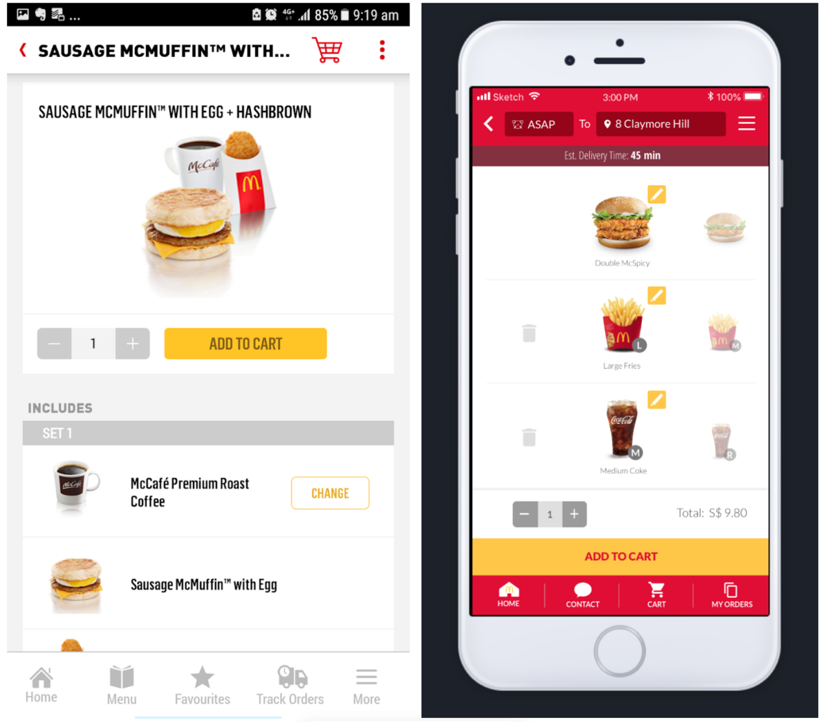
The left image shows the older version, with a simple add to cart button. However, the right visual depicts the new design, where users can edit each order component.
Although the initial version was good enough, users still had additional wishes, revealed via usability testing.
If you’re worried about your users being too polite to come forward with a criticism, one method to get them to reveal their true thoughts is to instruct them not to stop talking. In other words, to think aloud.
Give users your app, and have them test it while voicing any thought that comes into their head. Jakob Nielsen praises this method:
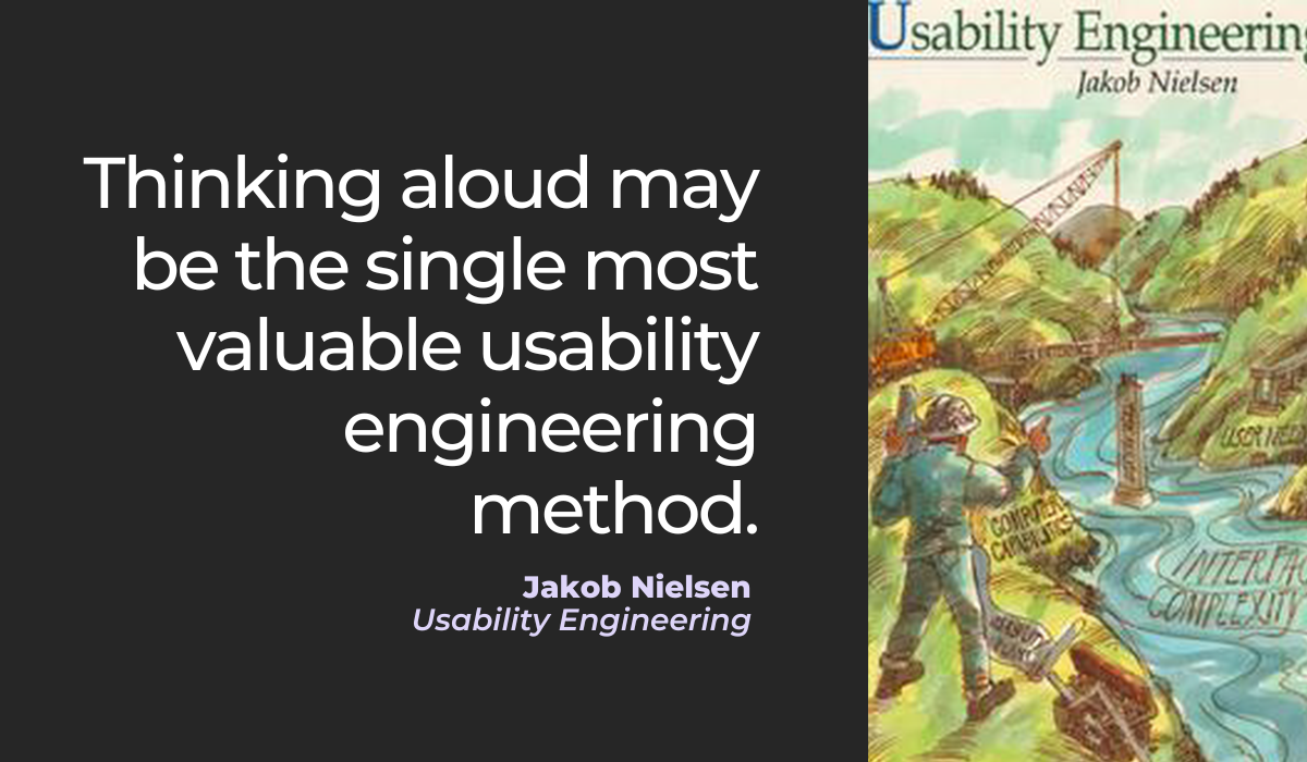
This tactic reveals an ongoing, unfiltered stream-of-consciousness commentary.
You’re guaranteed to discover what your users really think about the app and therefore bolster its usability.
Allows improvements to be made based on evidence
Your developers might have a new idea for improving your app (e.g., a grid layout), but who’s to say it’s actually an improvement?
Your team members think it’s a great suggestion, but their feelings aren’t a reliable yardstick.
Usability testing is more dependable. Instead of developers making assumptions, this testing uncovers concrete evidence that proves changes are necessary.
You’ll have a good reason to make edits.
Having such knowledge is crucial, considering the following statistic:
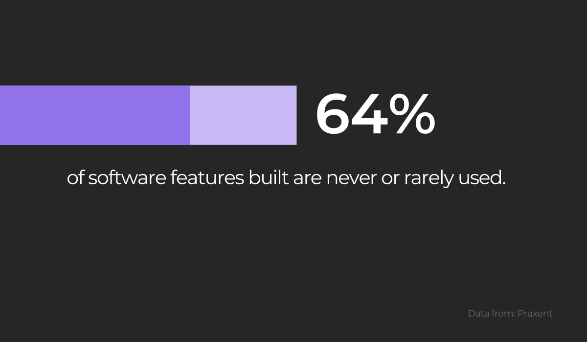
Given how few of the features an app offers are actually in use, you should make sure that the users utilize your newest update.
Usability testing can help with this and pinpoint the features users want.
For example, consider heat map testing. A data visualization depicting how app users scroll, click and move on the screen, heat maps unmask user-app interaction.
Consider this heat map analysis:
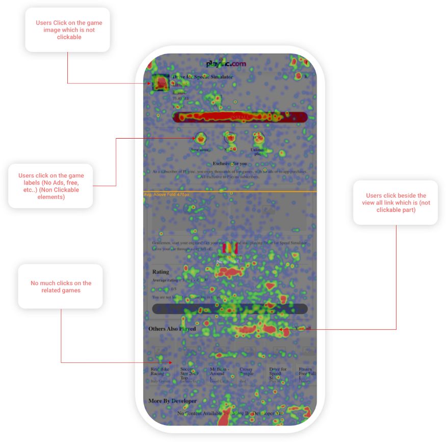
As you can see, in the example above, users often clicked on non-clickable elements, such as the image and game labels.
If you were the owner of the app in question, you’d have to wonder: why were they clicking there? What did they want to happen?
If nothing else, these non-clickable elements should be more obviously non-clickable to avoid disappointing the user.
However, heat map testing is only one component of usability testing. For a comprehensive usability review, your best bet is the PURE method.
Short for Practical Usability Rating by Experts, PURE is an analytical usability review where steps to complete tasks are judged on their difficulty.
Each step is scored on a scale of one to three, with one being easy and three challenging. By adding together all step scores, you’ll acquire a PURE score for that task.
The visual explains the process well:
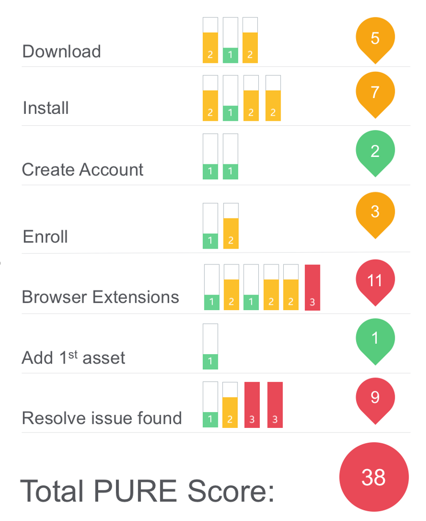
With this scoreboard, you’ll have a clear overview of how user-friendly your app is and what features require the most improvement.
You can then efficiently devote your efforts to enhancing these most inaccessible aspects.
Gives a competitive advantage over similar apps
The chief benefit of usability testing lies in the fact that it’s the potential clients who tell you precisely what they like, dislike, would include, and would exclude from your app. In other words, you have direct access to your target audience’s thoughts.
As such, by taking users’ preferences on board, there’s a high chance of gaining a competitive advantage over similar apps.
Consider, for example, this Reddit post:

The post dismisses apps without a dedicated website and store page and approves of those who incorporate them.
This comment alone provides those who take it into account a competitive edge over other apps, as developers now know what features to implement.
Such user feedback is so valuable partly because users have considerable exposure to other apps.
Whereas your team is hyper-focused on developing your specific application, users likely use multiple apps daily and know the most common pain points.
Look at the image below:
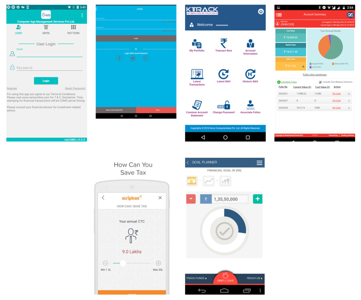
These fintech apps all share one characteristic—a bland, almost boring user design.
Imagine you’re conducting usability testing for a fintech app. Fintech app users will immediately recognize if your app shares leave a similar unfavorable impression.
If so, they will mention it. This criticism instantly gives you a significant advantage, as the user highlighted the sector’s principal drawback.
If you can circumvent it, your app is much more likely to succeed.
However, although originality is a virtue, you shouldn’t deviate from what’s expected too much.
For example, calling a homepage a startscreen or principal page isn’t productive, as such terms will only confuse users.
Luckily, usability testing unearths such unnecessary divergences from the norm, as users ensure your attempts at being competitive don’t sabotage you.
The Nielsen Norman Group summarized this phenomenon of adhering to accepted standard practices:
Users should not have to wonder whether different words, situations, or actions mean the same thing. Follow platform and industry conventions.
Paradoxically, maintaining competitiveness in the app market can constitute following the example of others.
Your users will likely say the same: copying conventional guidelines can actually be advantageous.
Conclusion
Implementing usability testing is a hugely rewarding practice. You’ll uncover countless insights about your app, therefore building a better user experience.
For starters, the testing type exposes usability issues and identifies problems with the user journey.
Furthermore, usability testing reveals what users really think about the app and allows improvements to be made based on evidence.
Ultimately, this will save developers valuable resources in the long run and also give their product a competitive advantage over similar apps.
Given these advantages, you’d do well to incorporate the practice into your app development. Your final product will undoubtedly benefit from it.
